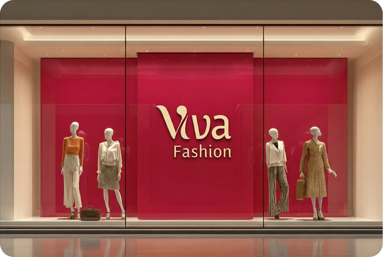
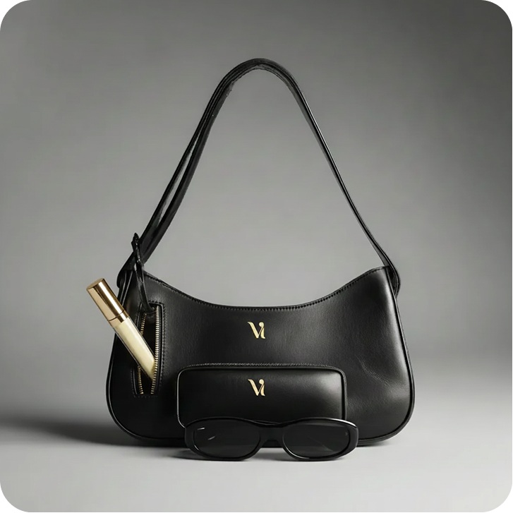
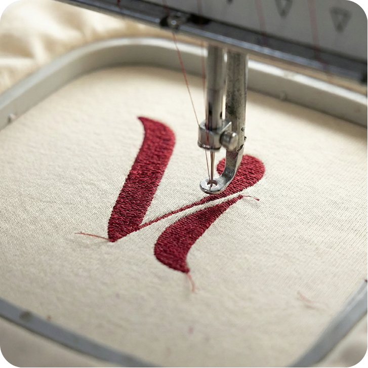
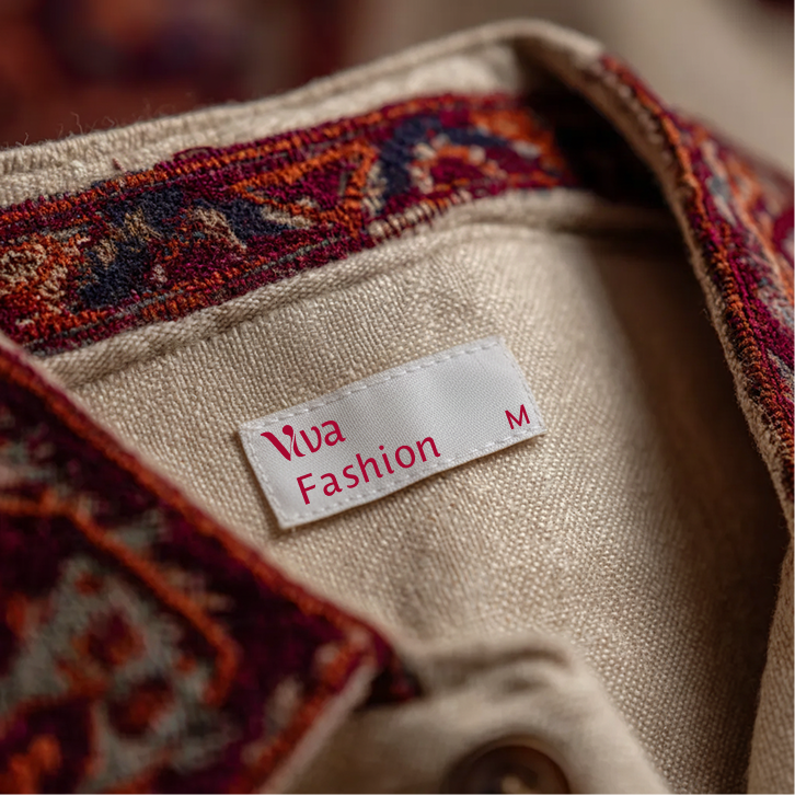
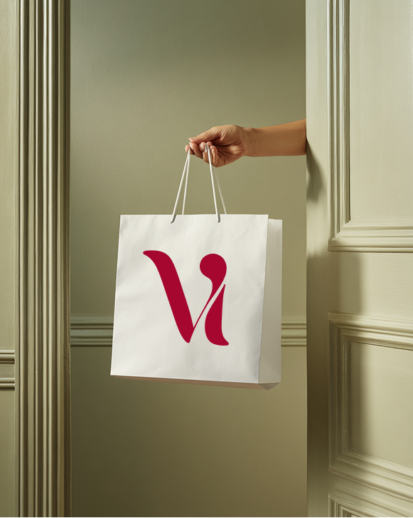
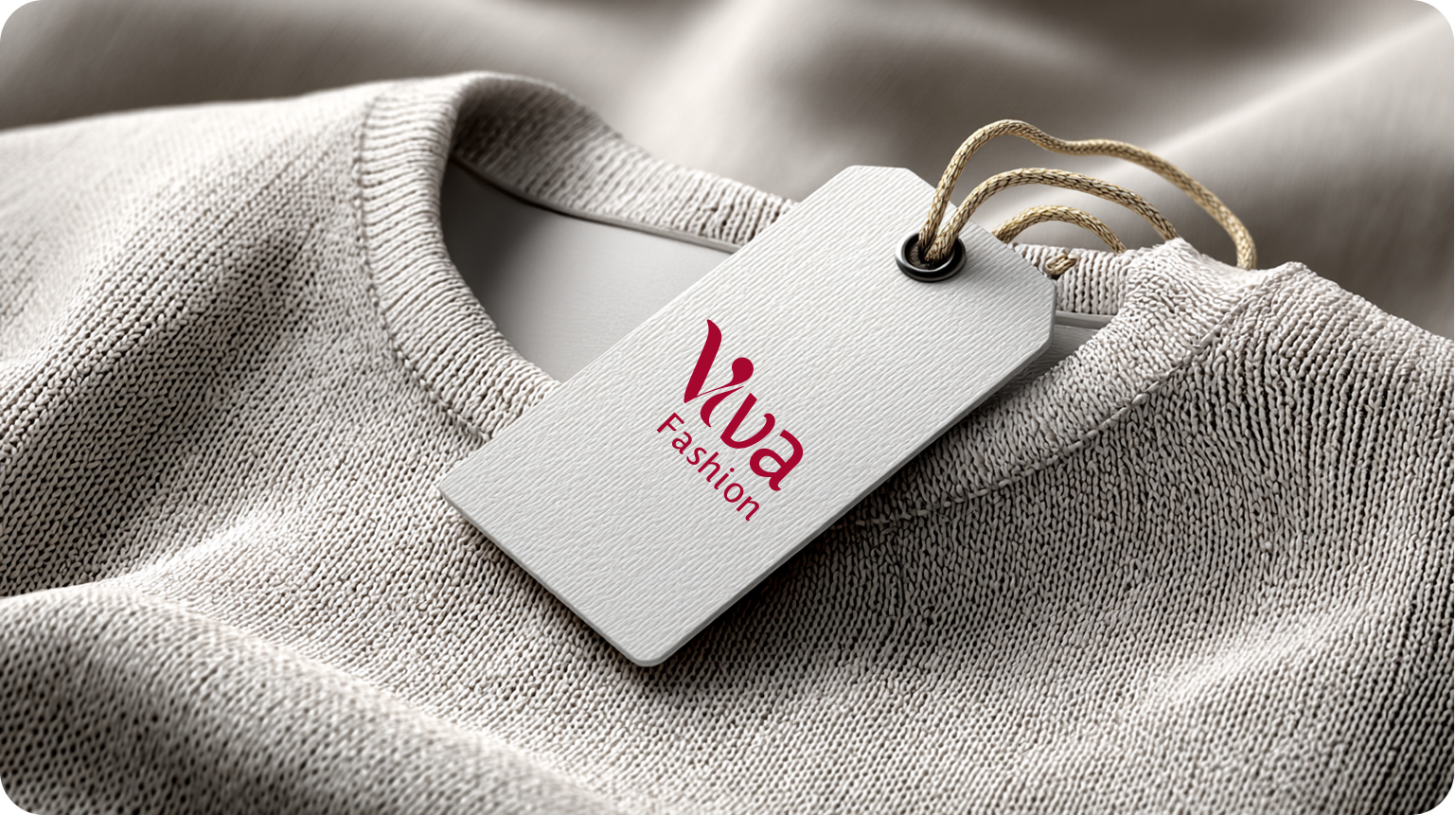
The Viva Fashion identity carried from the styleguide onto the pieces a customer actually holds: the swing tag, the garment label, the embroidered monogram, and the bag it all leaves the store in.
Storefront
Accessories
Embroidery
Garment Label
Shopping Bag
Swing Tag
Packaging
The unboxing, considered.
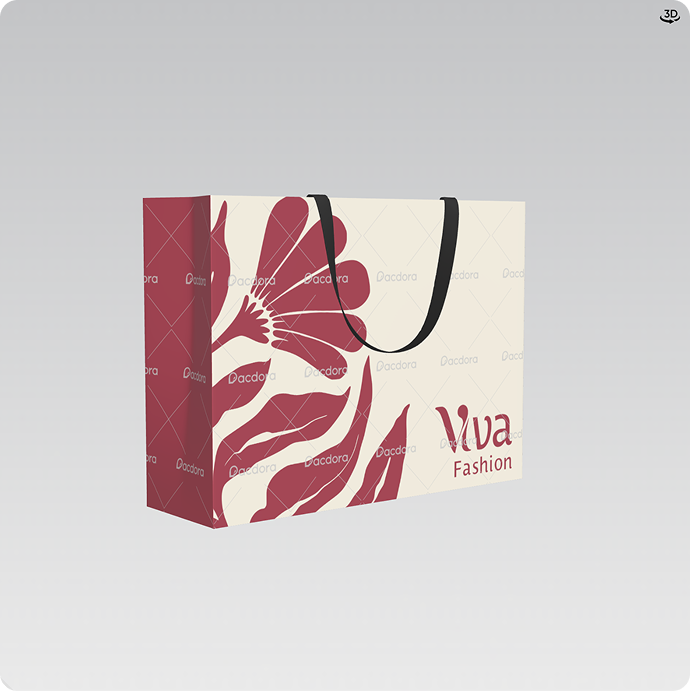
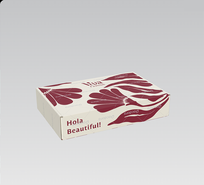
A shopping bag and mailer box carrying the brand's floral motif and a warm parting line, Hola Beautiful!, printed straight onto the packaging a customer takes home.
Shopping Bag
The floral graphic carried onto the bag customers leave the store with.
Mailer Box
The same pattern on the shipping box, with Hola Beautiful! as the parting line.
The Palette
Colour, straight from the brandbook.
Six named tones documented in the 2026 styleguide, from Viva Carmine through to True White.
#A5072F
Viva Carmine
A bold, confident red speaking to the passionate heart of the brand. Dramatic flair without shouting.
#C53D52
Crushed Petal
A deeply romantic, muted rouge capturing the feeling of vintage florals.
#D3726F
Coral Blush
Fresh, spirited, and full of life. Radiates the sheer joy of dressing up.
#F0DCAA
Champaign Drape
An effortless neutral that shines with understated luxury and a celebratory sparkle.
#FEF8E9
Ivory Lace
Soft and delicate, a calm highlight that lifts the mood with airiness and light.
#FFFEFA
True White
Crisp and clean. The canvas for the collection, ensuring every outfit feels fresh and balanced.
Typography
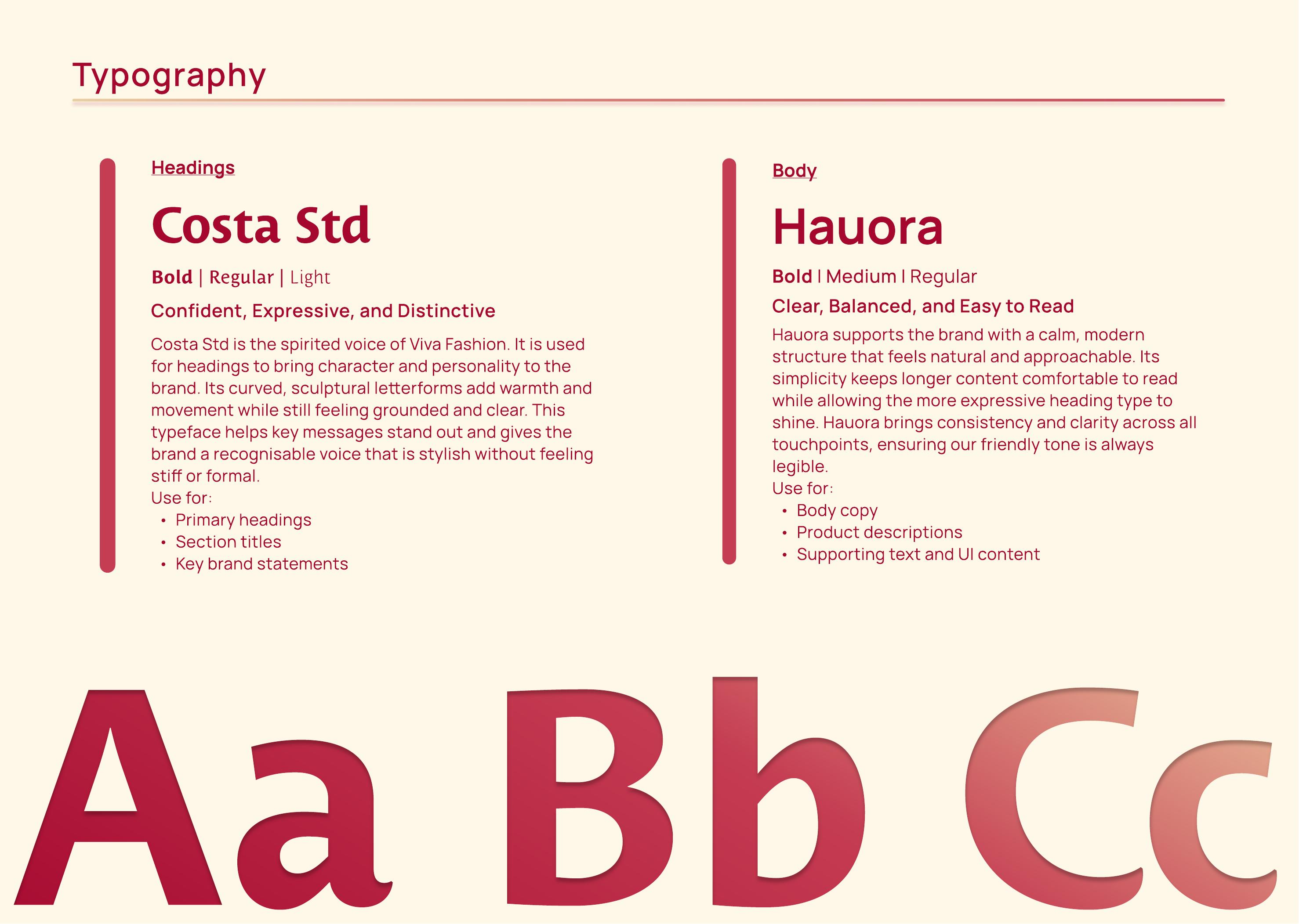
The typefaces documented in the brandbook.
Headings
Costa Std
The spirited voice of Viva Fashion. Curved, sculptural letterforms used for primary headings and key brand statements.
Body
Hauora
Calm and modern, keeping longer content comfortable to read while the heading type shines.
On this page, Fraunces stands in for Costa Std and Space Grotesk for Hauora, keeping the portfolio's own type system consistent across every case study.
The Brandbook
Straight from the guidelines document.
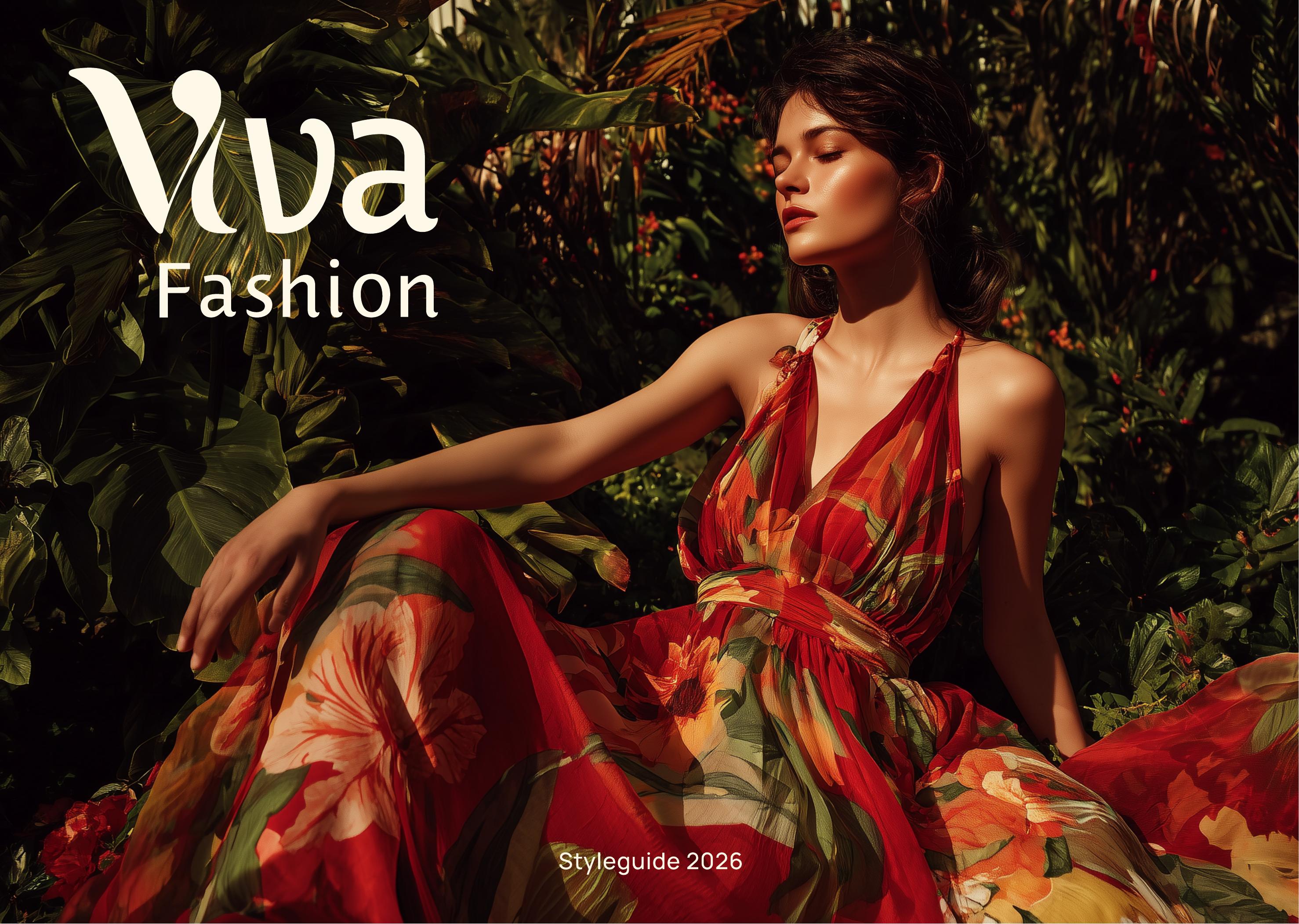
Three spreads pulled directly from Viva Fashion's brand styleguide, the source for every colour and font named on this page.
Cover
The guideline's cover: a floral-print editorial photo, Viva Fashion, Styleguide 2026.
Colour Palette
The documented palette, Viva Carmine through True White, with usage notes for each tone.
Typography
The typography page: Costa Std for headings, Hauora for body, shown at full type scale.
Brought to Life
From deck to checkout.
This identity was carried through into a full Shopify rebuild: mobile-first product and collection pages, a migrated catalogue of 186 products, Klaviyo email flows, and foundational SEO. The brand system wasn't just a deck. It became the actual customer experience, from the first scroll to checkout.
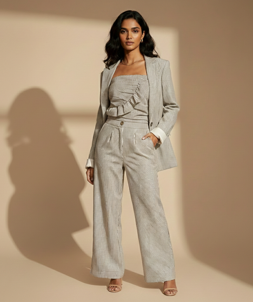
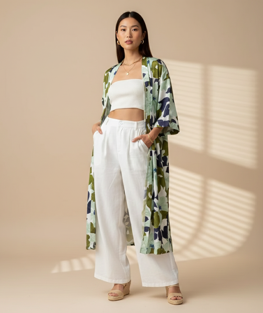
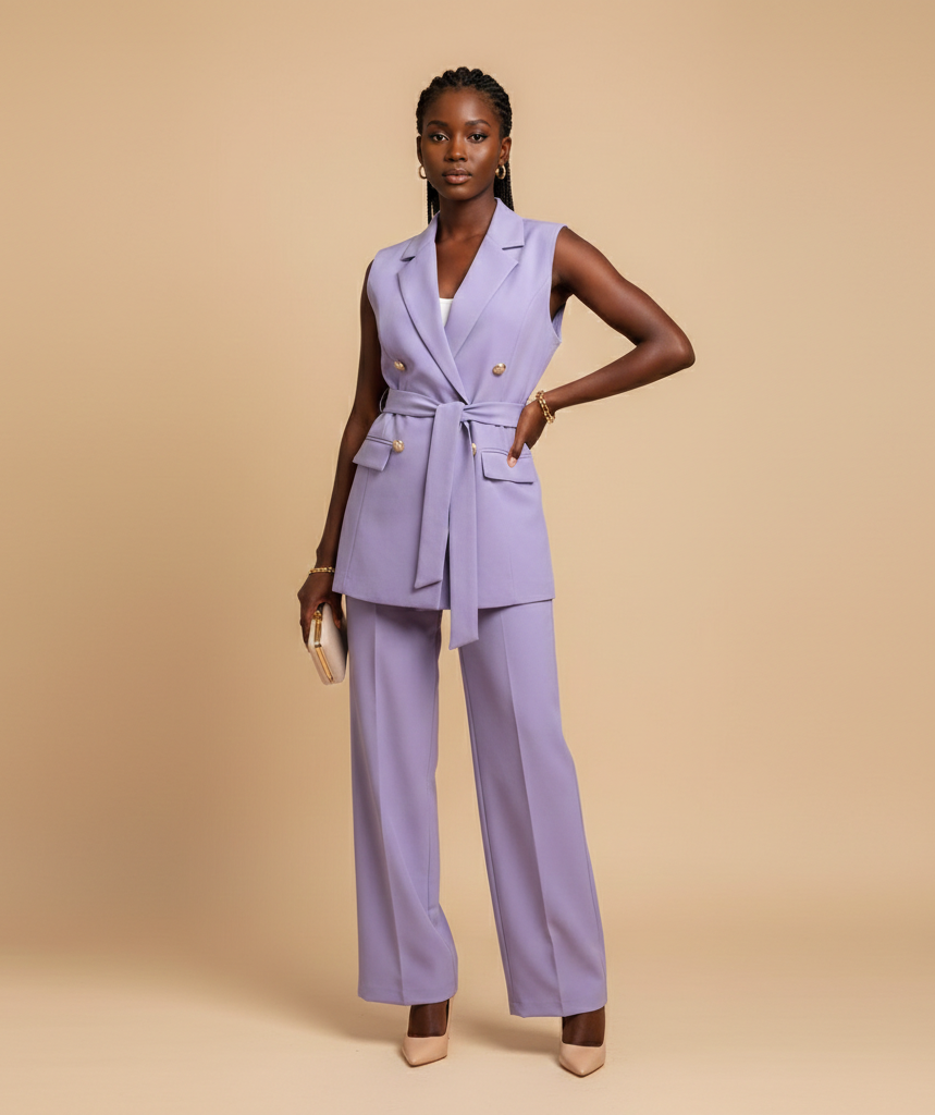
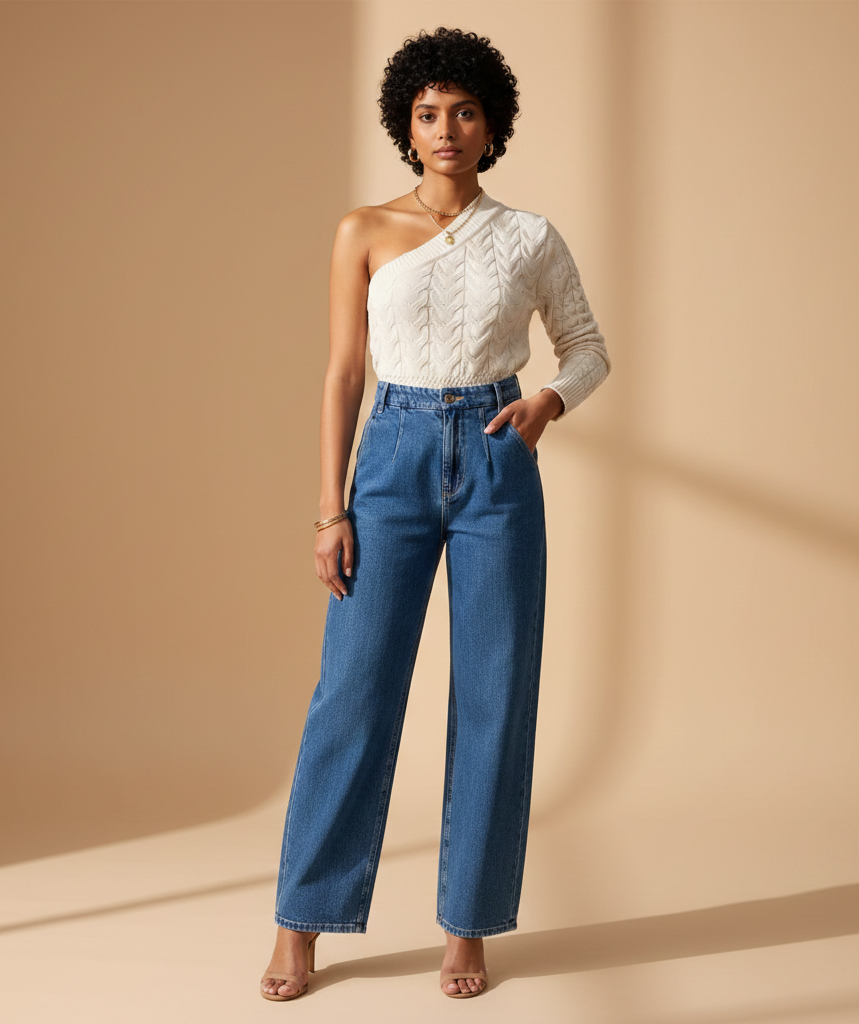
Product Photography
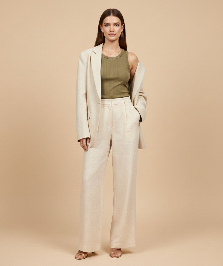
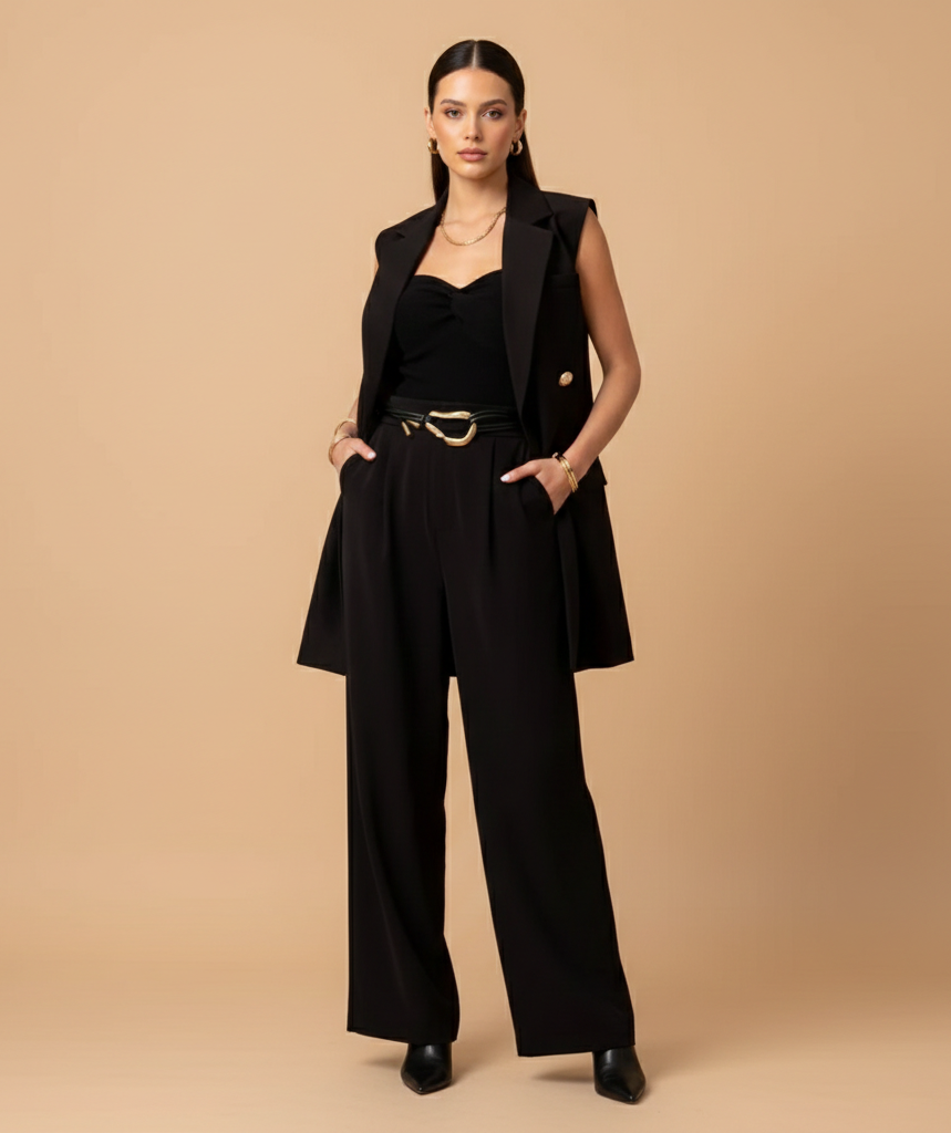
When the client's own product photos weren't good enough to launch on.
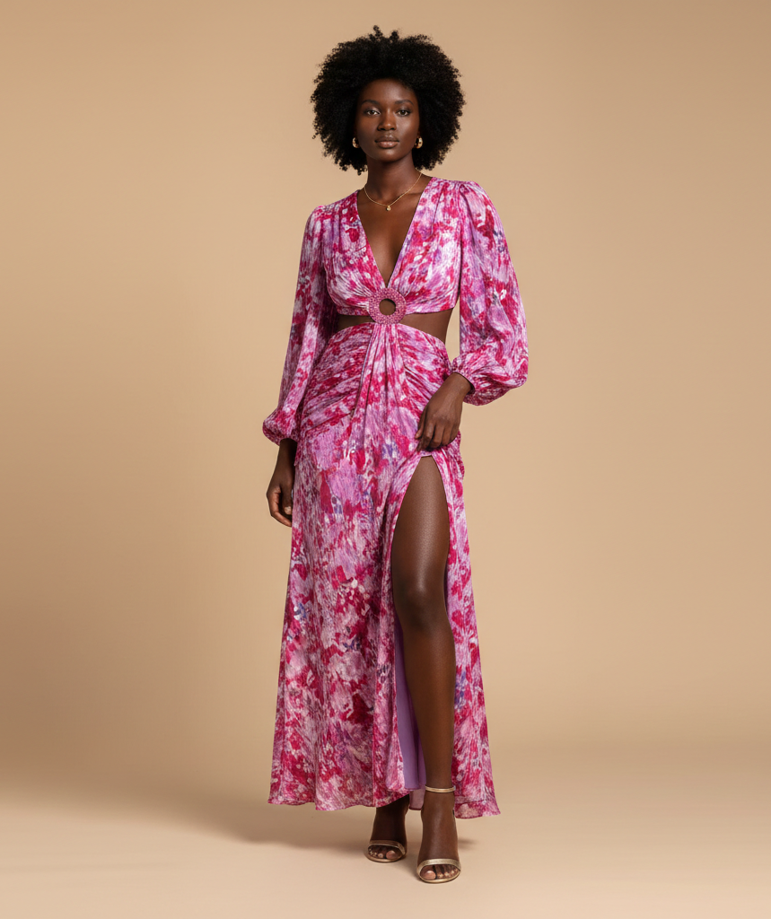
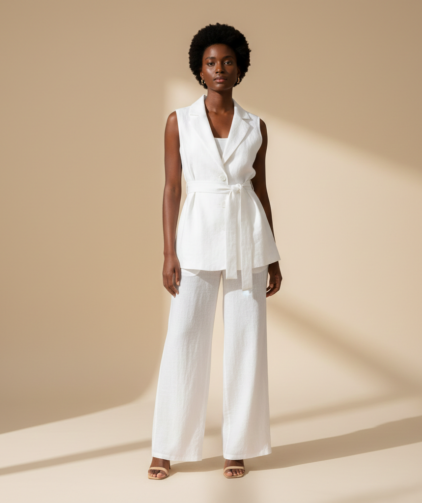
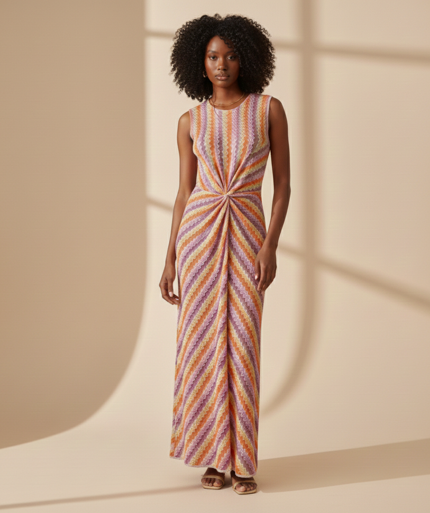
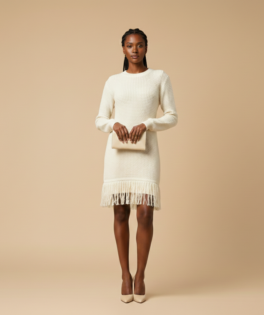
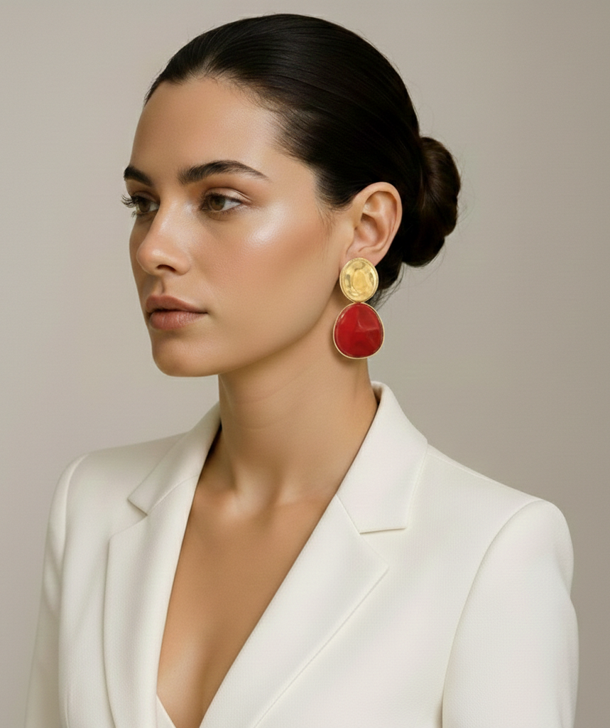
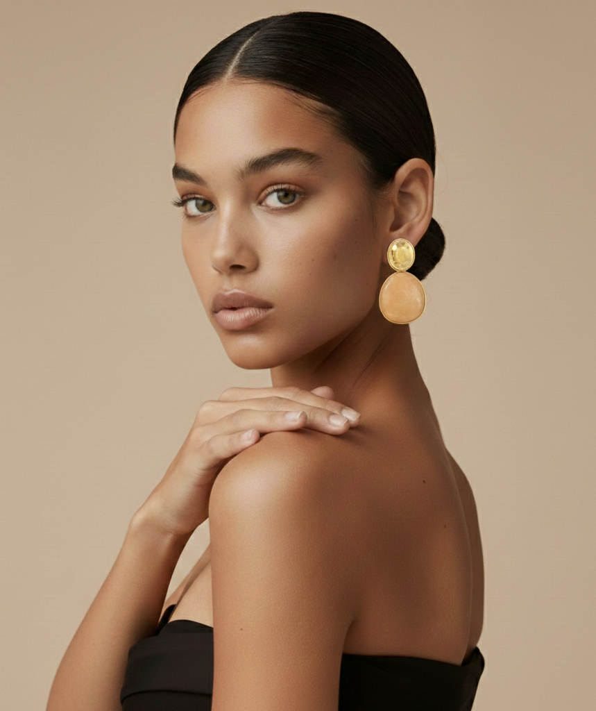
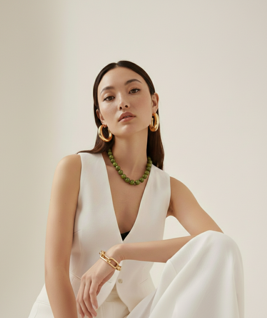
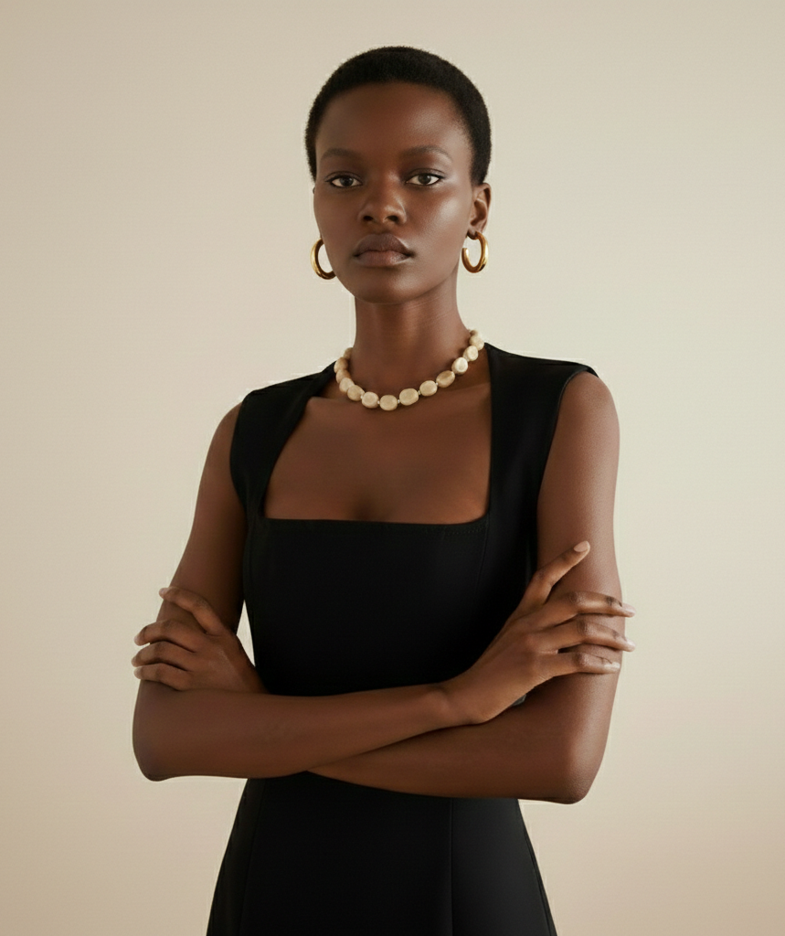
Rather than schedule a reshoot, AI-generated imagery closed the gap: three consistent angles per product, generated and quality-checked at full catalogue scale. Shown here is a curated selection from the full set.
140Products
420Images Generated
3Angles Each
Clothing
Tailored Blazer Set
Belted Trouser Set
Pinstripe Suit
Floral Kimono Duster
Lavender Vest Suit
Cable-Knit & Denim
Pink Floral Wrap Dress
Linen Vest Set
Striped Knit Dress
Fringe-Hem Knit Dress
Jewellery
Red Drop Earrings
Gold Coin Earrings
Layered Necklace & Earrings
Beaded Pearl Necklace
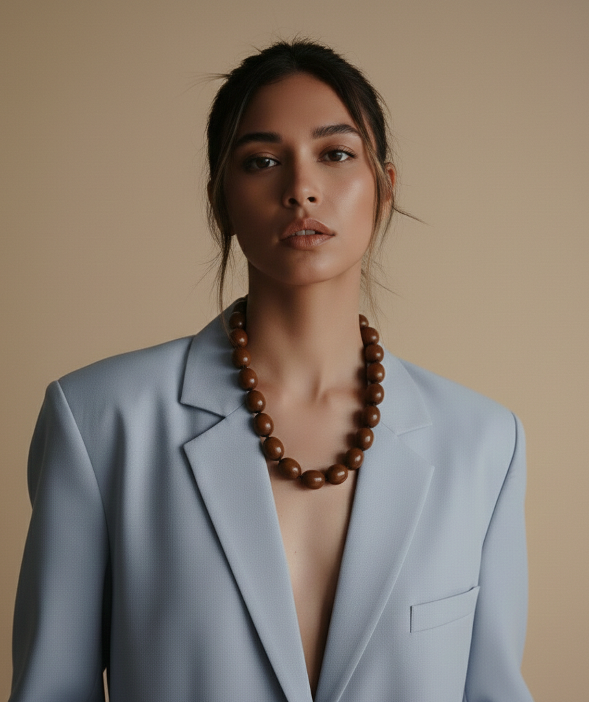
Wooden Bead Necklace
The Thinking
A positioning problem, not a facelift.
Brief
The product wasn't the problem.
A vibrant style guide for a European womenswear retailer, built to feel like a trusted friend with great taste, not a catalogue. The brand around the product looked generic and didn't signal the quality shoppers were actually receiving.
Strategy
A special find, not a discount.
The audience: women 30 to 65, not fast-fashion shoppers, who want a purchase to feel like a find rather than a discount. That reframed the brief, and even shaped merchandising decisions like bundling, because that feeling is the brand's emotional core.
Creative Direction
Warm, never salesy.
Viva Carmine and Coral Blush carry the warmth, Costa Std brings expressive headlines, and photography leans on lush nature and sun-drenched light, warmer than the clinical product shots typical of this price bracket.
"Style that breathes. Polished without the pressure."
Function Driven Language, Viva Fashion Styleguide
The Takeaway
Viva Fashion needed one thing more than anything else: for the brand to feel as good as the clothes.
Starting from positioning and audience insight instead of screens meant every downstream decision, palette, tone, even how discounts were framed, spoke with the same voice. That's the work of a brand strategist, not just a designer.