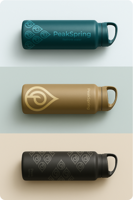
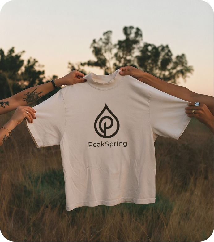
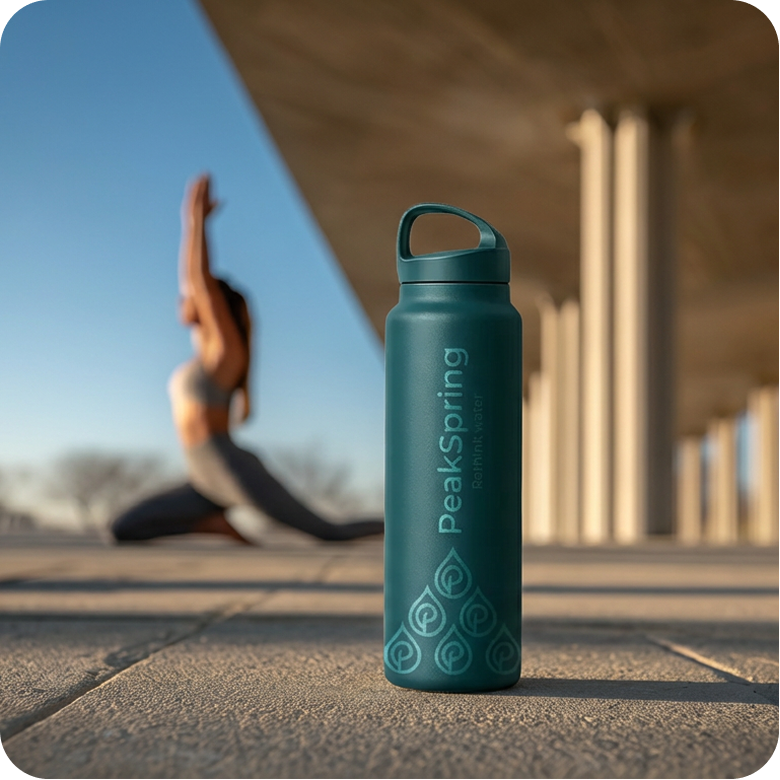
PeakSpring's brandbook carries the identity all the way to shelf and product, straight from the guideline's own mock-up pages.
Packaging
Apparel
Lifestyle
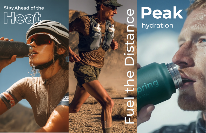
In Use
The Campaign
One brand, two very different reasons to buy it.
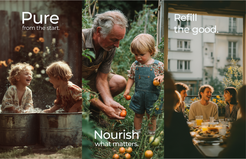
PeakSpring's audience splits into two clear segments, health and fitness buyers, and parents. Rather than force one message onto both, we built two campaign directions, each speaking to what that customer actually cares about, and used them across distinct pages of the website.
Athletic & Performance
Built for people who sweat for it: heat, distance, and the hydration that keeps up with both.
Wellness & Purity
The brand softened into daily ritual: purity, presence, and the things worth slowing down for.
A segmented funnel built for a real sales team.
This positioning was translated into a segmented Webflow funnel: distinct landing pages for each audience, both funnelling to a single CTA, with CRM and automation built for a real sales team, and SEO, analytics, and pixel tracking to support acquisition.
The Palette
Colour, straight from the brandbook.
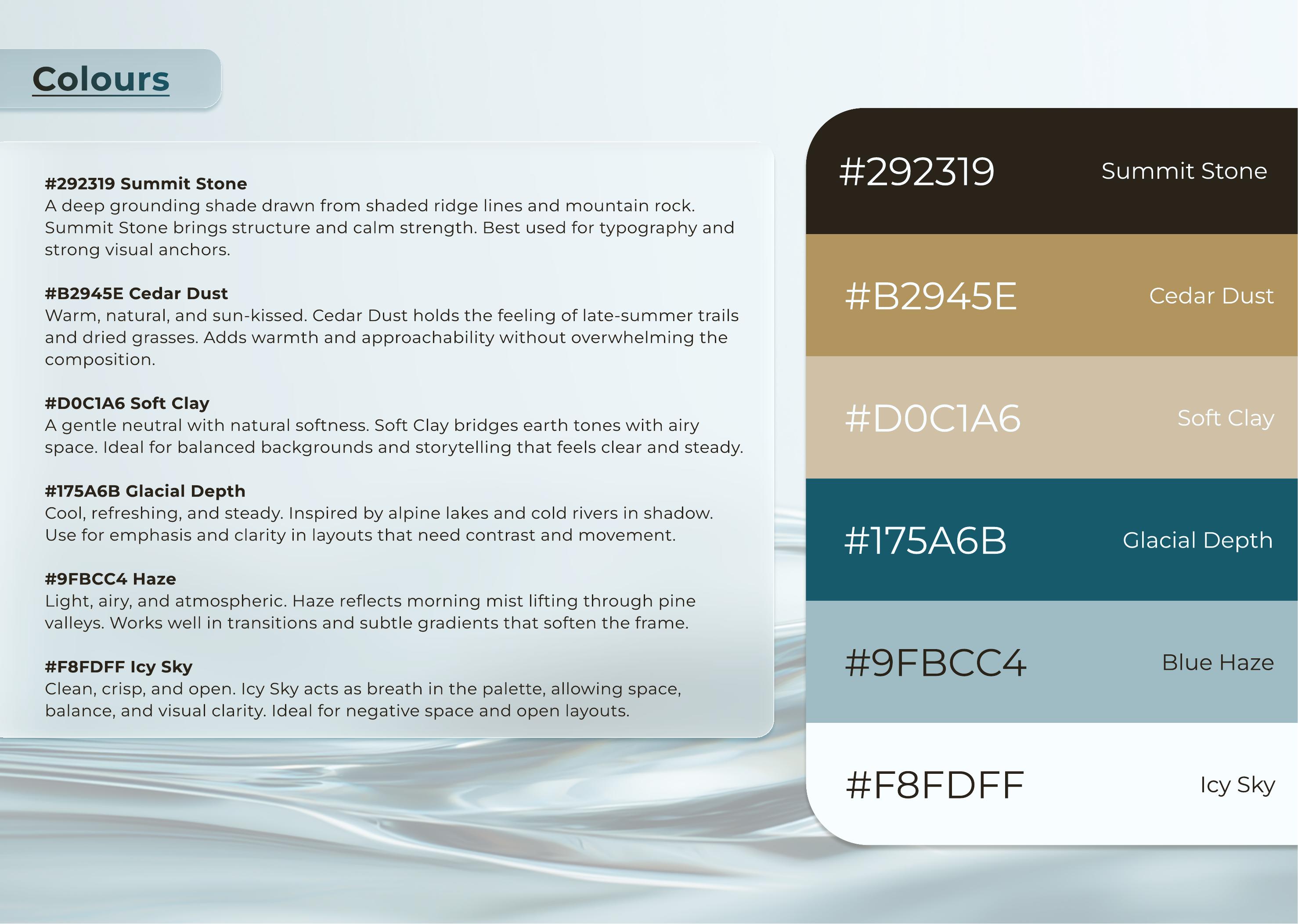
Six named tones plus three documented gradients (Dark, Light, and Spec) built for hero sections, backgrounds, and premium product moments.
#292319
Summit Stone
A deep grounding shade drawn from shaded ridge lines and mountain rock. Used for typography and strong visual anchors.
#B2945E
Cedar Dust
Warm, natural, and sun kissed. Holds the feeling of late summer trails and dried grasses.
#D0C1A6
Soft Clay
A gentle neutral bridging earth tones with airy space, for balanced backgrounds and storytelling.
#175A6B
Glacial Depth
Cool, refreshing, and steady, inspired by alpine lakes and cold rivers in shadow.
#9FBCC4
Blue Haze
Light, airy, and atmospheric, reflecting morning mist lifting through pine valleys.
#F8FDFF
Icy Sky
Clean, crisp, and open. Acts as breath in the palette for negative space and clarity.
Typography
The typefaces documented in the brandbook.
Typeface
Montserrat
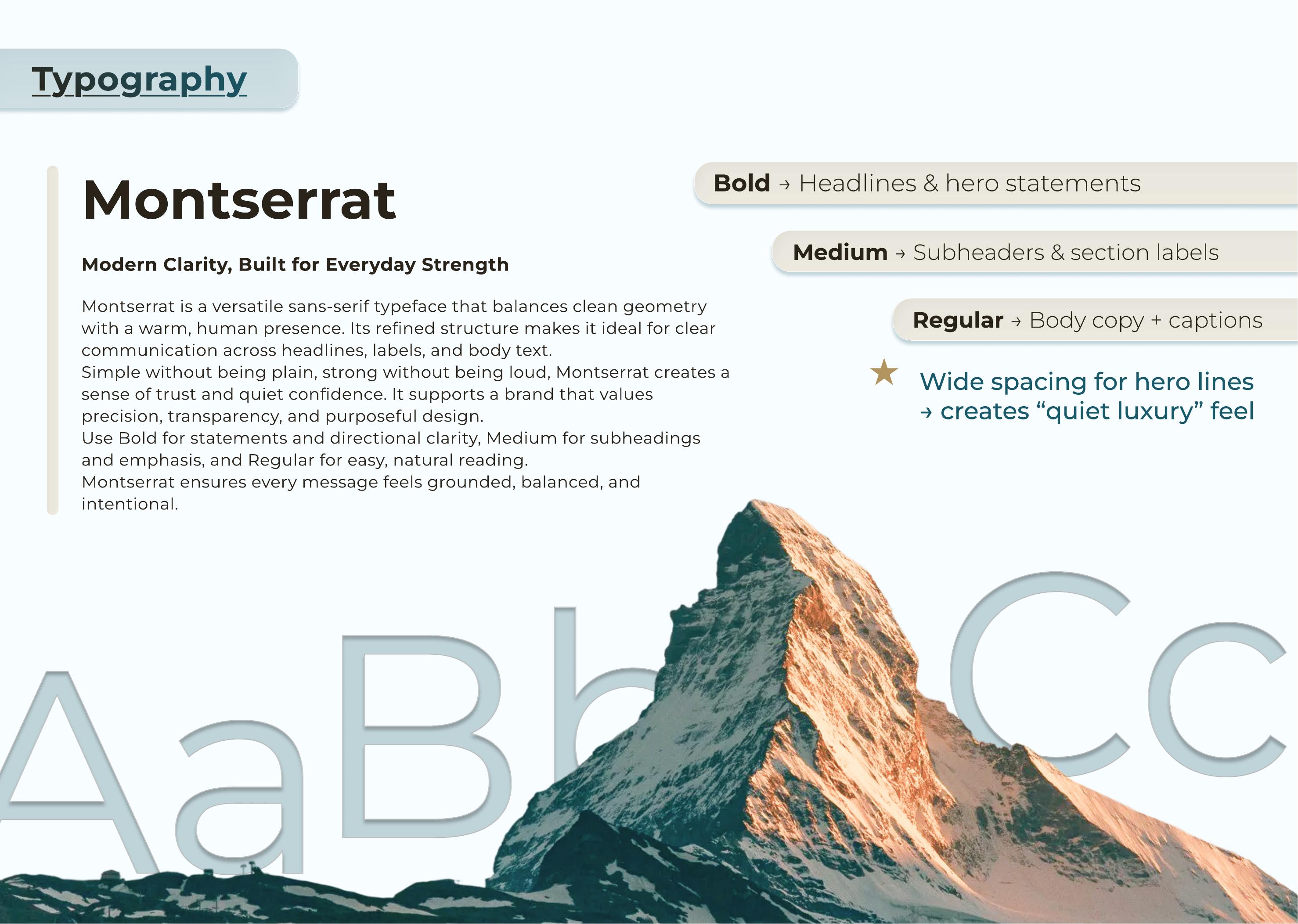
A single versatile sans-serif used across the system: Bold for headlines and hero statements, Medium for subheaders, Regular for body copy.
Voice
Wide tracking
Wide letter spacing on hero lines is used deliberately to create what the guidelines call a quiet luxury feel.
On this page, Fraunces stands in for display moments and Space Grotesk for the Montserrat body system, matching the calm, grounded tone documented in the guidelines.
The Brandbook
Straight from the guidelines document.
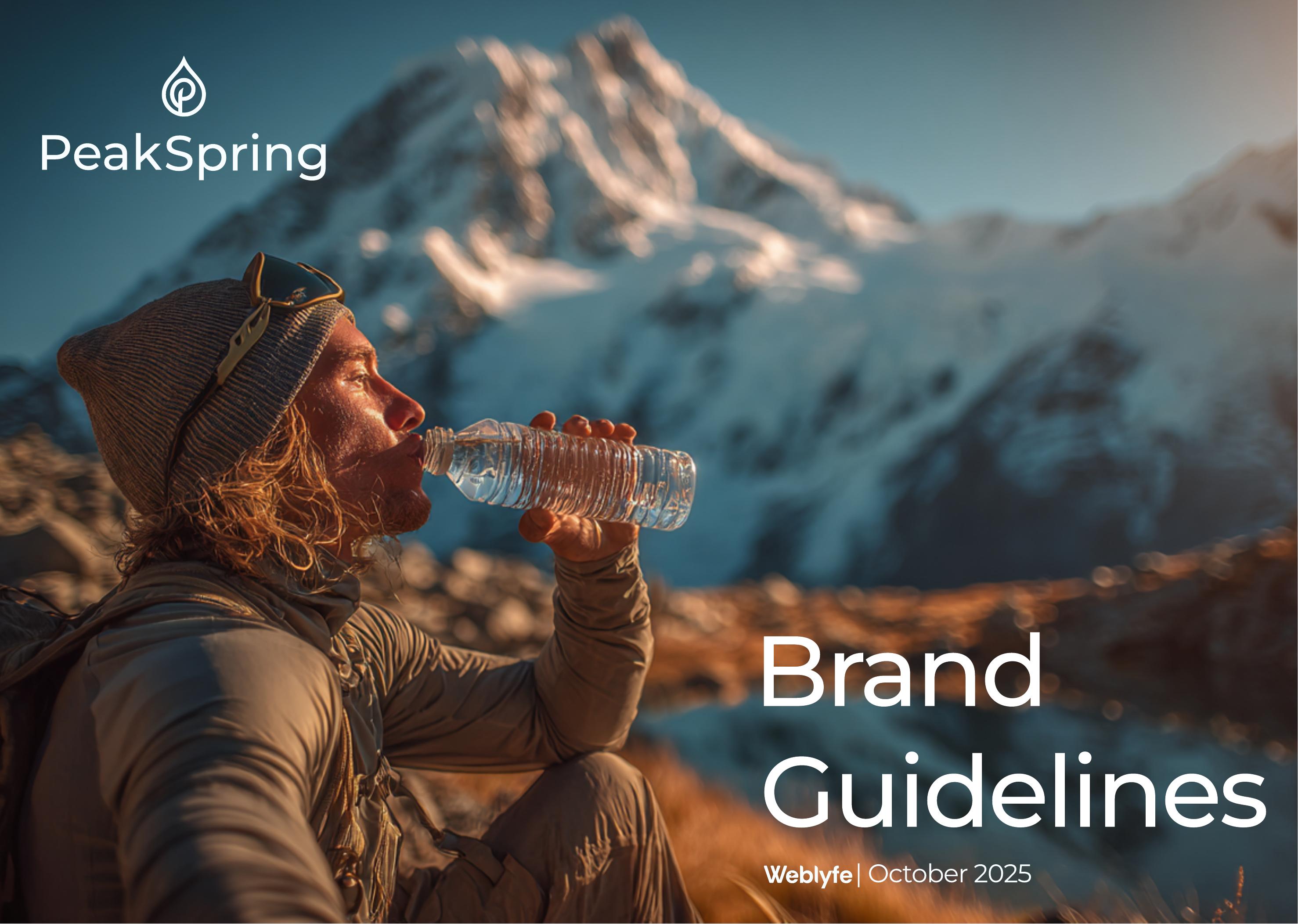
Three spreads pulled directly from PeakSpring's brand guidelines, the source for every colour and font named on this page.
Cover
The guideline's cover: a hiker drinking from a PeakSpring bottle against an alpine backdrop, Brand Guidelines, October 2025.
Colour Palette
The documented six-tone palette, Summit Stone through Icy Sky, shown as full-bleed swatches.
Typography
The typography page: Montserrat shown across Bold, Medium, and Regular weights, with usage roles.
The Thinking
Certification and results should speak, not marketing copy.
Brief
A category built on distrust.
PeakSpring sells a medically certified water ionisation system at a high price point, to research-driven buyers skeptical of anything that feels like a placebo. Every brand value, Living Water, Purposeful pH, Conscious Footprint, translates a technical benefit into something felt.
Strategy
Restraint as credibility.
Two audiences, health and fitness buyers, and parents, one governing idea: resist over-explaining the science. Before locking the logo, four concepts were scored against five criteria and benchmarked against Bang & Olufsen, Oura Ring, and LARQ.
Creative Direction
Quiet luxury.
Grounded, refined, assured: confident without being loud. Photography leans on natural light and honest textures, drawn from water and mountain-sourced imagery, not glossy stock.
"The result: water that nourishes from within."
What Makes PeakSpring Different, Brand Guidelines
The Takeaway
A high-ticket, unfamiliar product doesn't sell itself just because the site looks premium.
PeakSpring needed a positioning and identity people would trust, built on a defensible creative process, right down to how the logo itself was chosen. That's what separates a brand from a paint job.