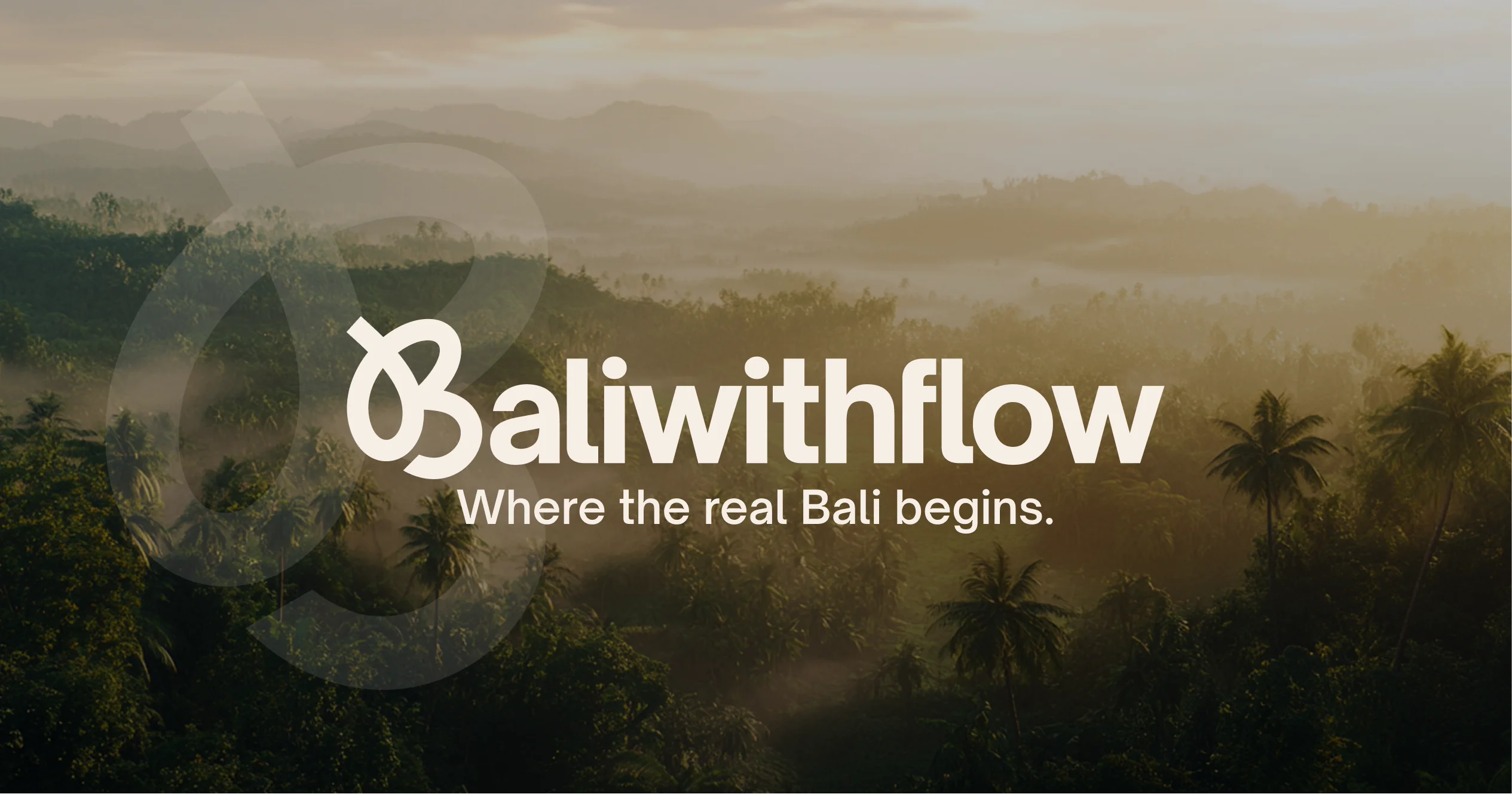
Where the real Bali begins.
A curated travel brand founded by Flora, a long-time Bali local. One brand had to hold a €40 self-guided guide, curated day trips and €15,000 VIP vacations, and then a live pivot, without ever feeling like a patchwork.
- Client
- BaliwithFlow
- Year
- 2025
- Industry
- Curated travel experiences
- Scope
- Brand identity, platform, automations
- Also
- CRM, payments, SEO
- Live site
- baliwithflow.com →
The thinking.
(One path, not three funnels)- 01Three offers, one brand.
Flora sells a self-guided PDF guide, curated day trips and high-ticket VIP vacations. The challenge was letting the cheapest and the priciest offers live under one brand without either undercutting the other’s credibility.
The brief - 02Built to hold a pivot.
Persona research across luxury travellers, digital nomads and eco-conscious couples shaped one customer journey holding all three price tiers. When the business grew to include small-group escapes mid-engagement, the architecture simply extended.
The strategy - 03Quiet luxury with soul.
Calm, authentic and grounded in nature, avoiding both budget-travel cliché and cold corporate luxury. The tone treats a €40 guide and a €15,000 trip as two doors into the same considered world.
Creative direction
“Travel becomes more than movement. It becomes awakening.”Company description · BaliwithFlow styleguide
The identity, off screen.
(Studio door to travel bag)The BaliwithFlow mark carried off screen, from the studio door to the bag it travels in.
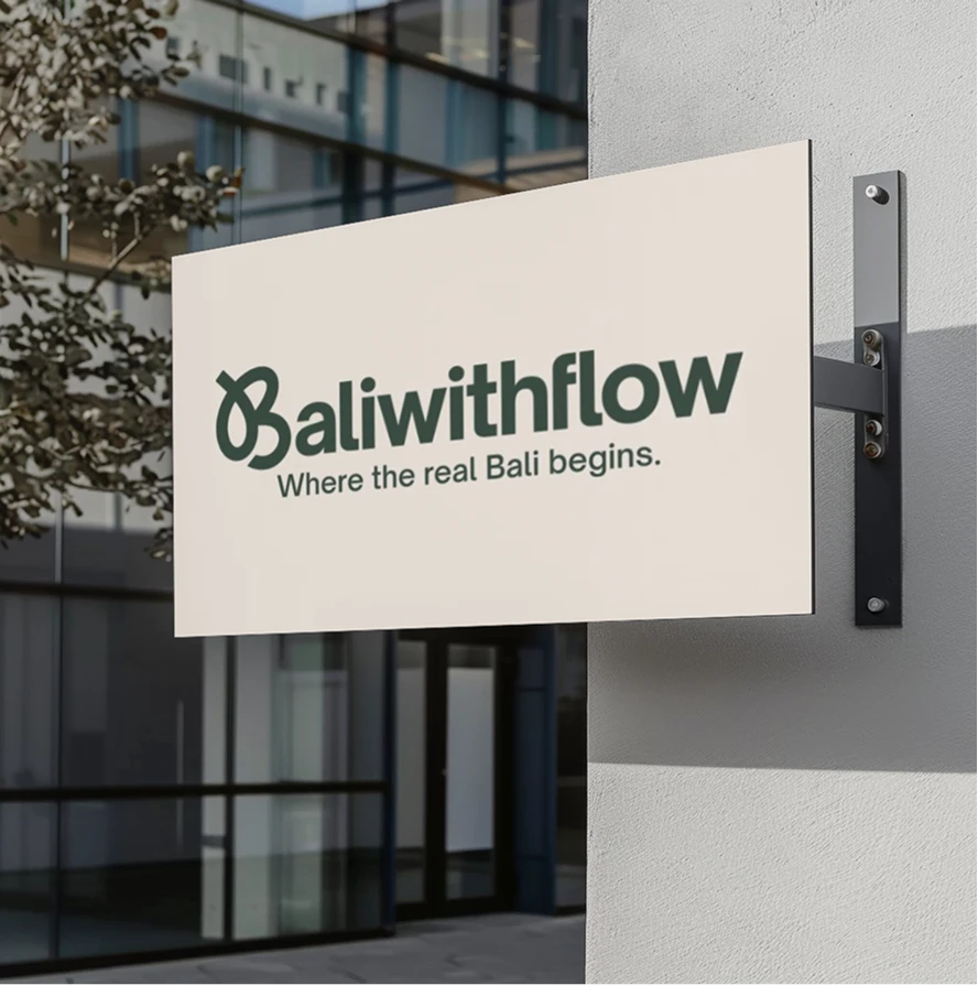
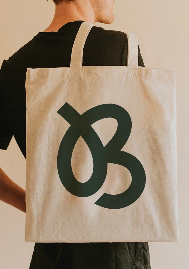
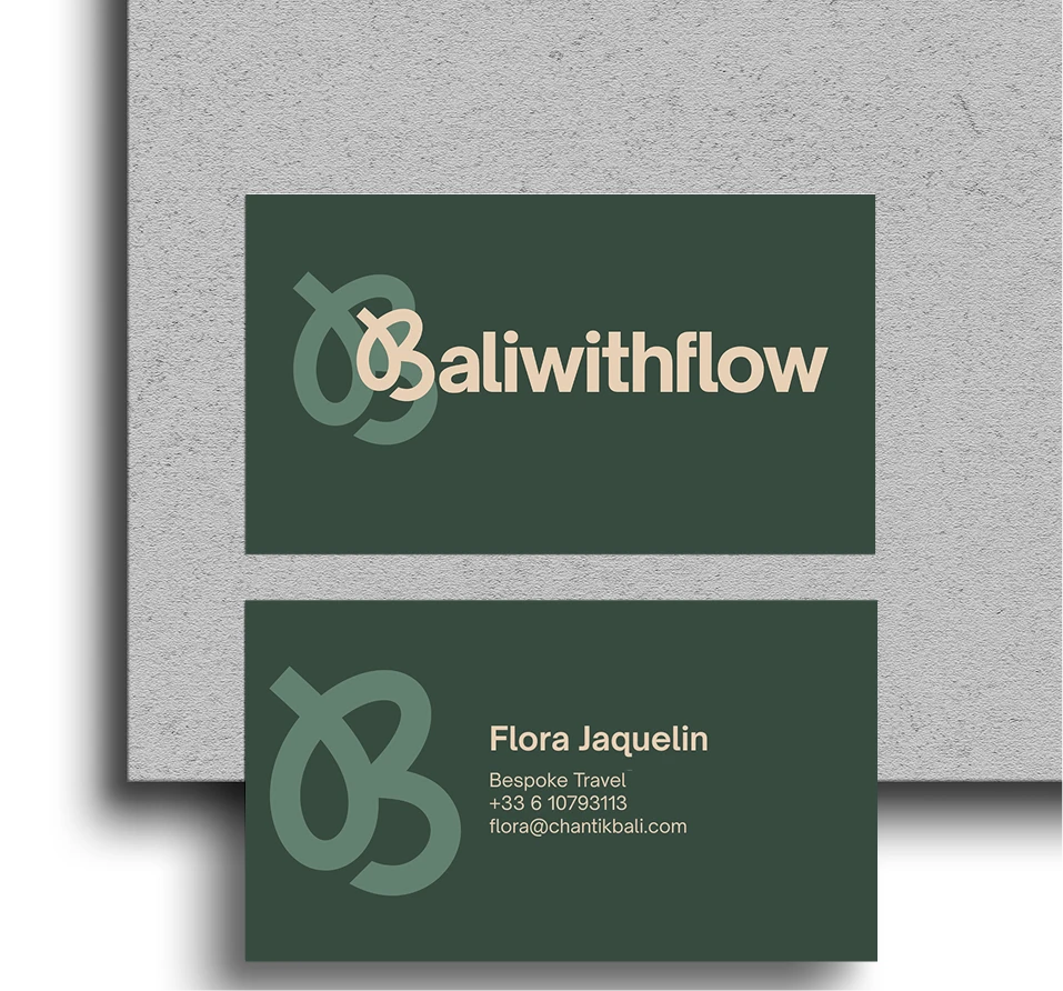
Three offers, still handled by one person.
The positioning was carried into a Figma-to-Webflow build with neurodesign and animation applied to the conversion path, plus CRM and payment automation connecting the guide, day trips and high-ticket inquiries into one system, and a foundational SEO and tracking setup.
One line, with flow.
(The mark)The B of Bali, drawn as one soft, looping stroke: a letter that reads as a path, which is exactly what the brand sells.
- 01The B of Bali
The initial carries the whole name, so the mark works on its own on a tote, a card back or a favicon.
- 02A path, not a letter
The stroke enters from outside the letter and loops through it, like a route leading in: the flow in BaliwithFlow.
- 03Soft, unhurried curves
Rounded and even in weight, matching the calm, humanist shapes of Open Sauce Sans.
- 04Quiet luxury
One confident shape with no ornament, at home on a €40 guide and a €15,000 trip alike.
One path, many doors.
(The structure)Instead of three competing funnels, every offer sits on one deliberate journey. Tap a door to see what it is and how the platform handles it.
Colour, straight from the brandbook.
(Dark Hunter Green to Sunshine Surprise)A deep, grounding green from Bali’s forests and temple stones.
Lush and earthy, the island’s vibrant nature.
A warm, sandy neutral of soft coastlines.
Creamy and calm, lightness and flow on every touchpoint.
Airy and fresh, a whisper of early morning mist.
Bright and joyful, sunrise moments and spontaneity.

A modern, humanist typeface with soft curves and balanced structure. One family carries the whole system, from headlines to body copy.

Calm, clear and made to flow across digital and print, with the Medium weight bridging headings and text.

Specimens are the real Open Sauce Sans, cropped straight from the 2025 styleguide
The styleguide.
(Three spreads from the guidelines)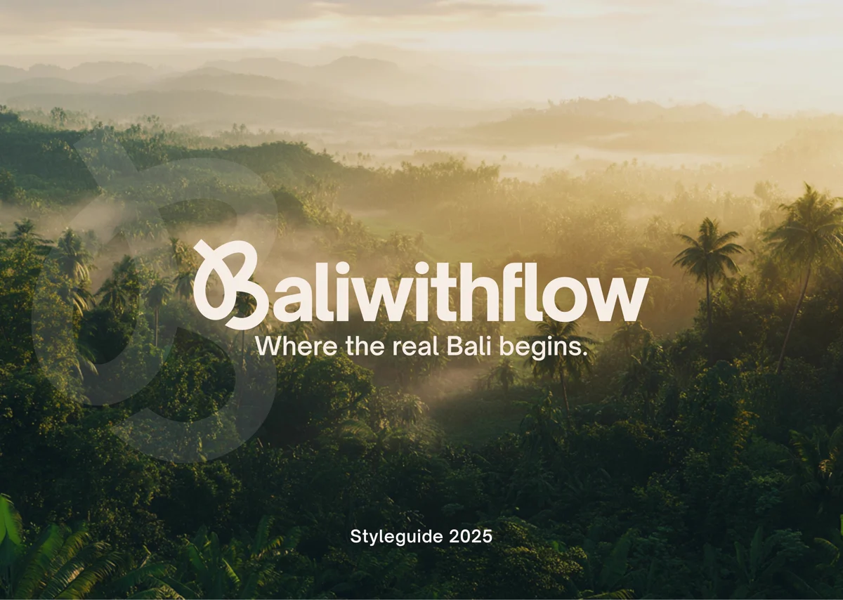 Cover
A misty jungle canopy at dawn: where the real Bali begins, Styleguide 2025.
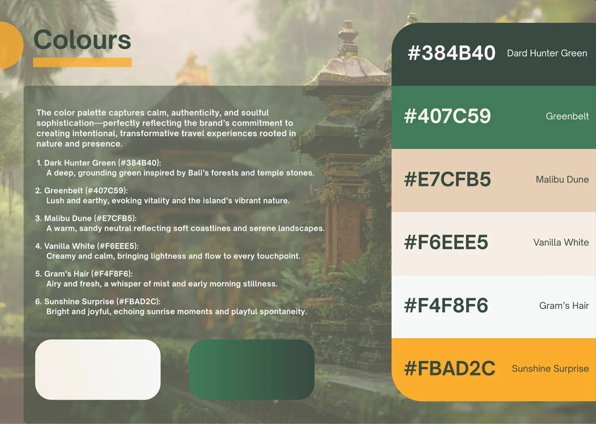 Colour palette
Dark Hunter Green through Sunshine Surprise, over a Balinese temple.
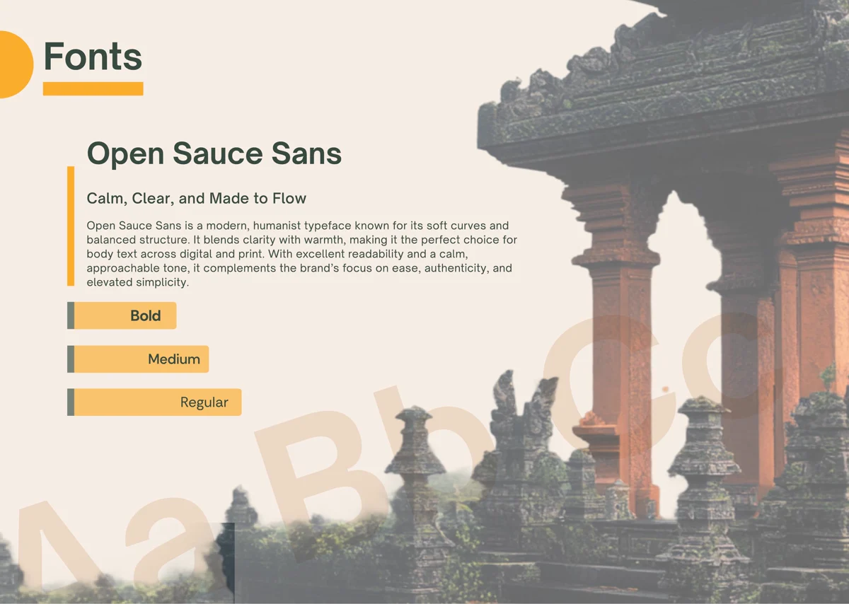 Typography
Open Sauce Sans at full type scale, against a temple archway.
Three offers, one considered world.
BaliwithFlow needed a brand strategy that could hold three different products and, as it turned out, a live pivot, without ever feeling like a patchwork. Starting from persona work and positioning instead of screens is what made that possible.
Next project.
(Back to 01 / 08)
 Viva Fashion
 Van Straaten
 IOnlyBookVIP
 CZA Bouwbedrijf
 Vanessa Nantes
 Email Elixir