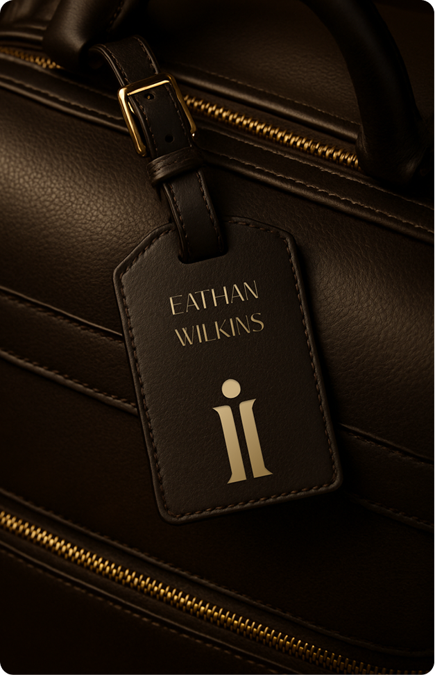
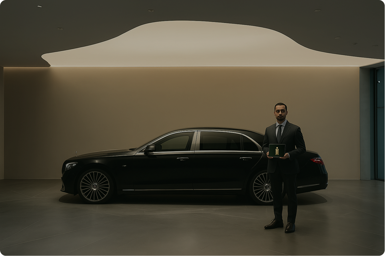
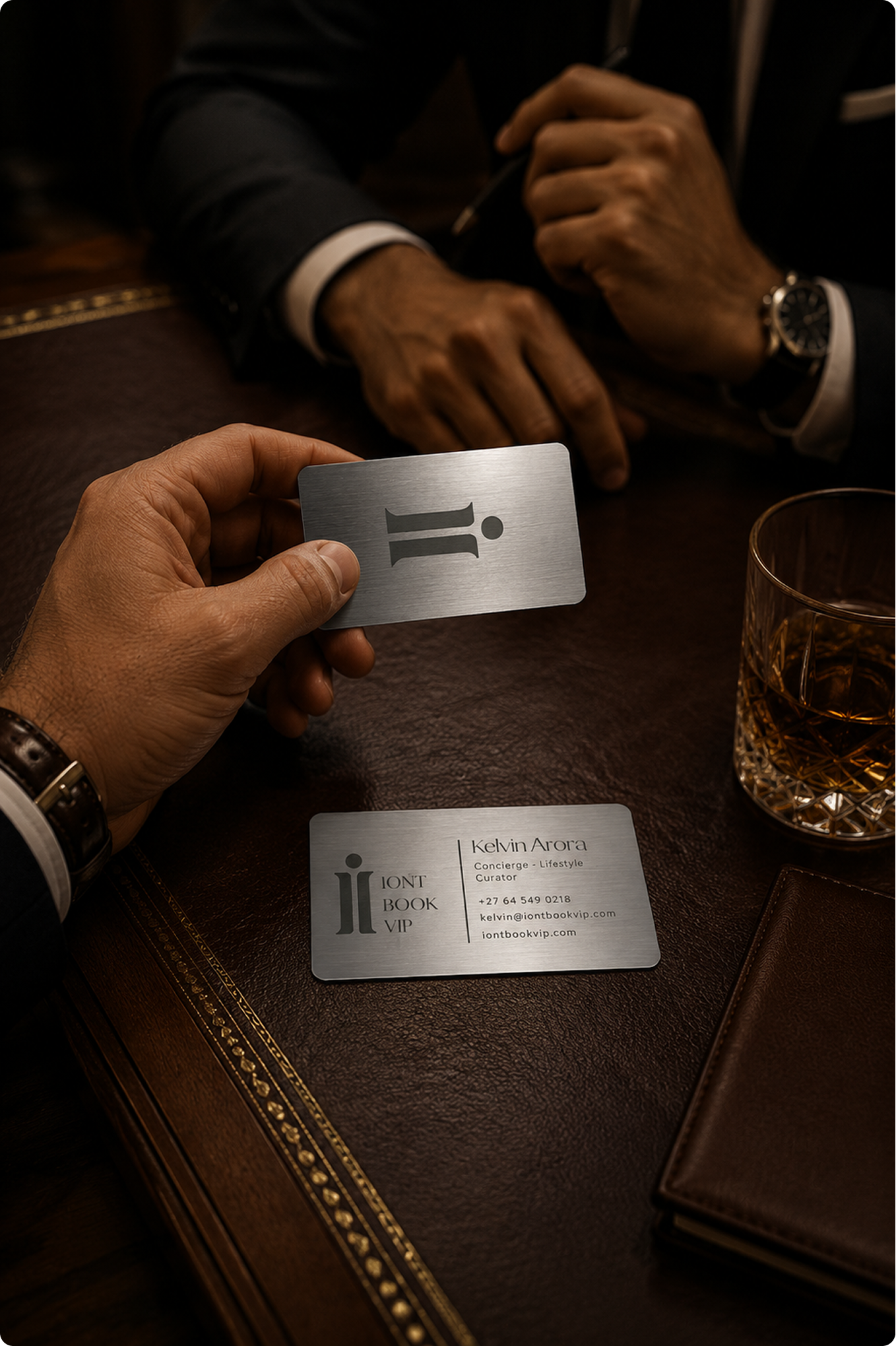
The ii mark carried across the physical moments a client actually touches, from the luggage tag on the jet to the card handed over the table.
Luggage Tag
Signature Pen
Private Pick Up
Member & Business Cards
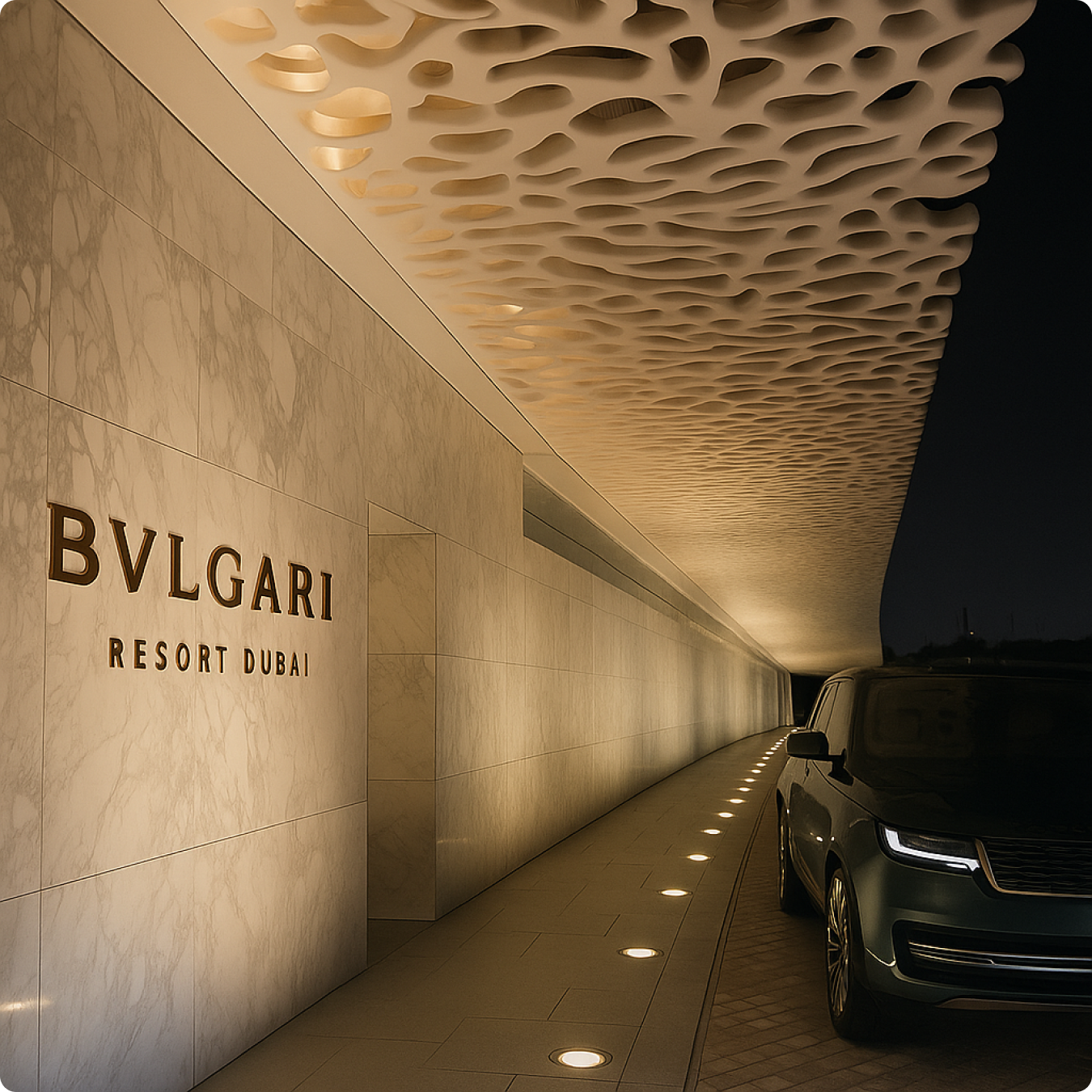
The Mood
The world this client already lives in.
The mood the identity was built to sit inside, the cabin, the lounge, the tarmac, the arrival, shot with the same restraint as the brand itself.
Instagram
The brand voice, built for the feed.
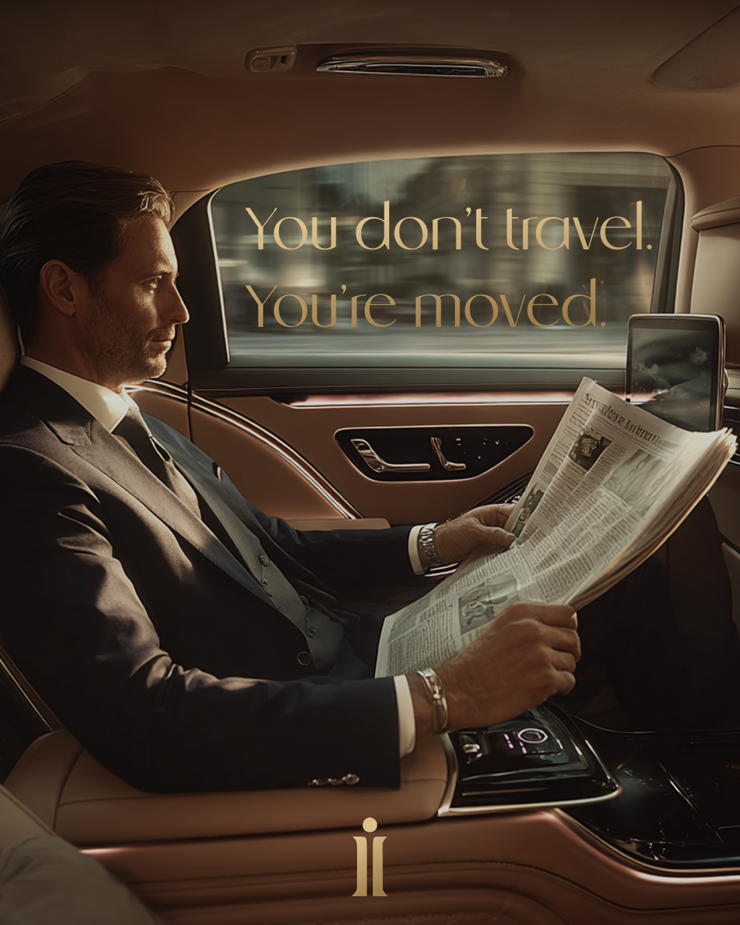
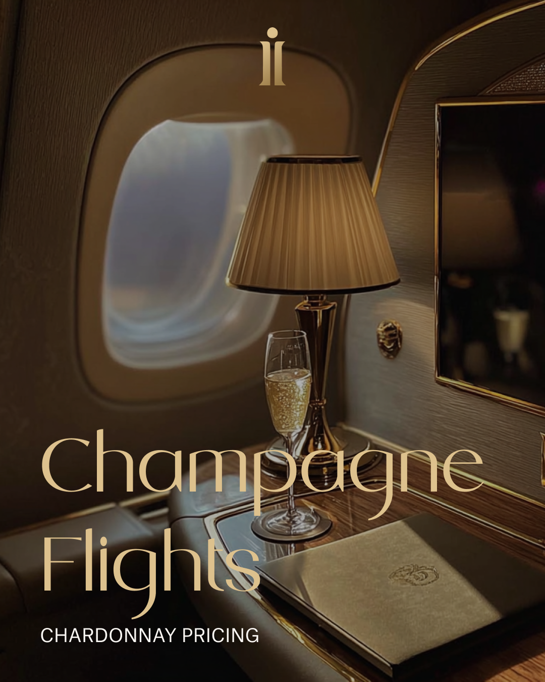
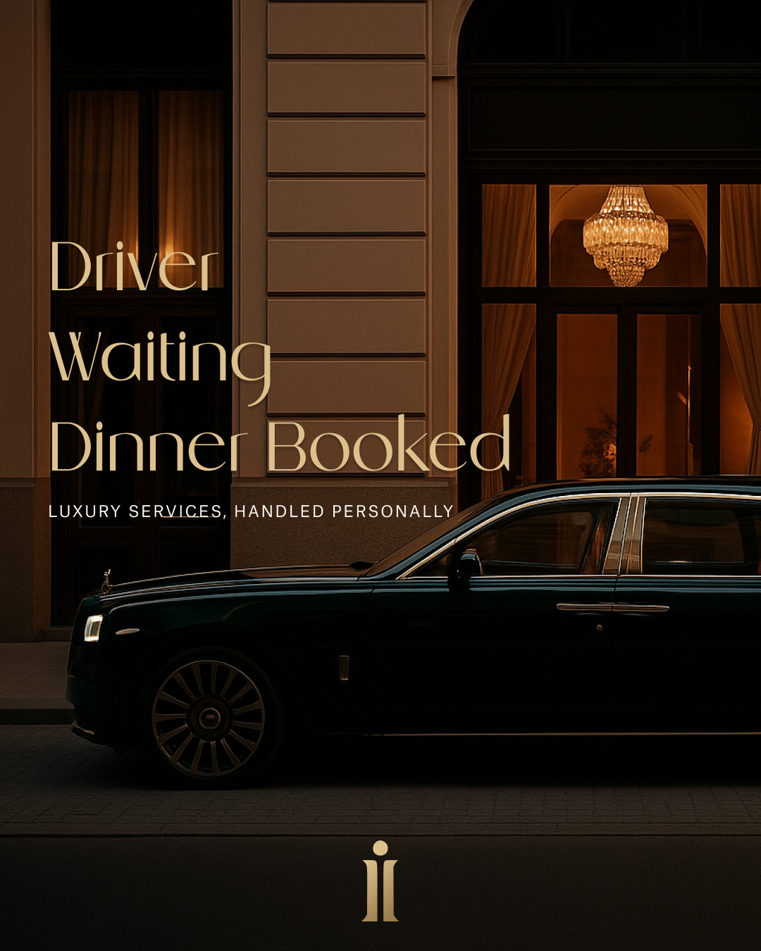
Three posts from the launch content set, each one leaning on the same quiet, image-led confidence as the rest of the identity.
The Palette
Colour, straight from the brandbook.
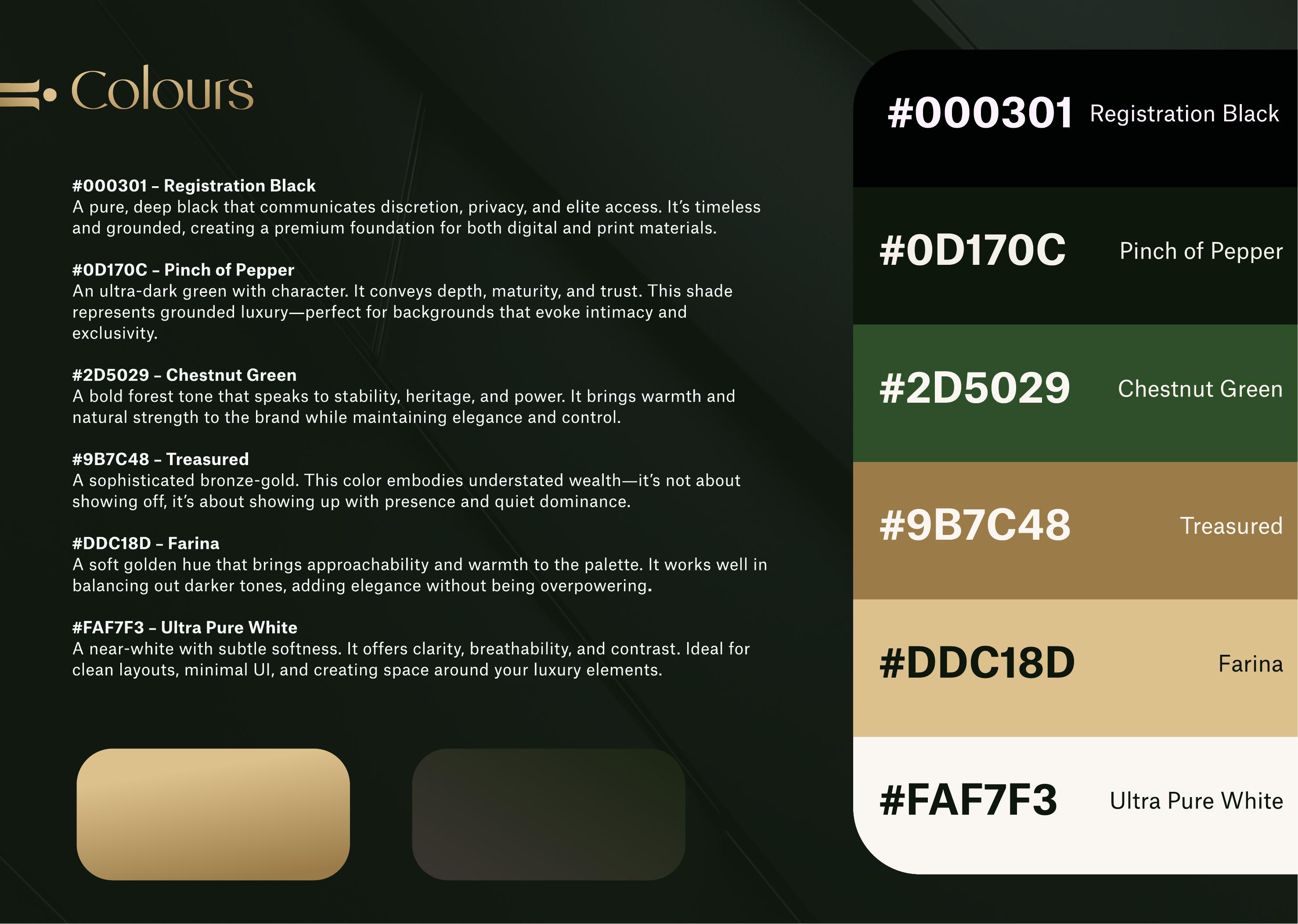
Six named tones documented in the IOnlyBookVIP 2025 styleguide, from Registration Black through to Ultra Pure White.
#000301
Registration Black
A pure, deep black communicating discretion, privacy, and elite access.
#0D170C
Pinch of Pepper
An ultra-dark green with character: depth, maturity, and trust.
#2D5029
Chestnut Green
A bold forest tone speaking to stability, heritage, and power.
#9B7C48
Treasured
A sophisticated bronze gold. Understated wealth, quiet dominance.
#DDC18D
Farina
A soft golden hue bringing approachability and warmth to the palette.
#FAF7F3
Ultra Pure White
A near white with subtle softness, for clarity and breathability.
Typography
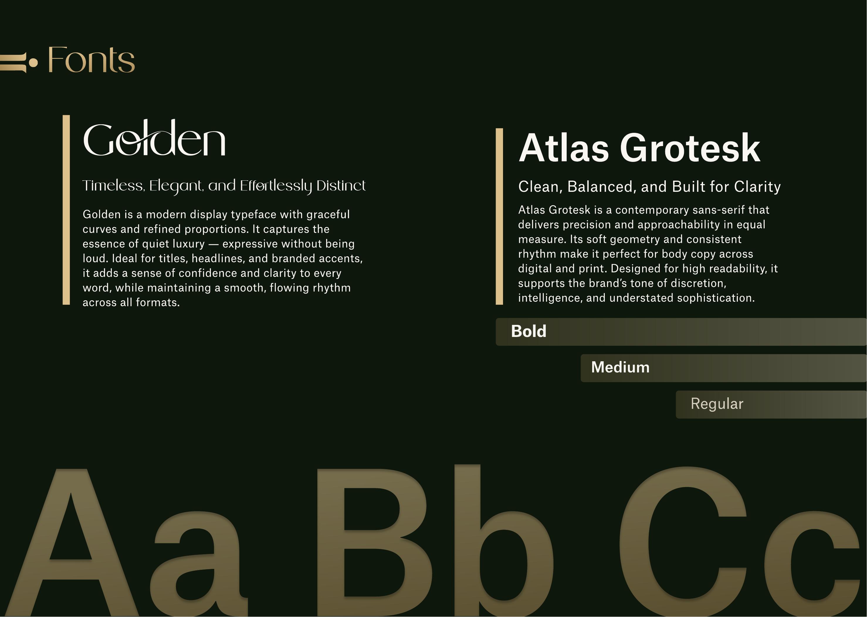
The typefaces documented in the brandbook.
Headings
Golden
A modern display typeface with graceful curves, capturing quiet luxury, expressive without being loud.
Body
Atlas Grotesk
A contemporary sans-serif delivering precision and approachability, built for high readability.
On this page, Fraunces stands in for Golden and Space Grotesk for Atlas Grotesk, matching the restrained, discreet tone documented in the styleguide.
The Brandbook
Straight from the guidelines document.
Three spreads pulled directly from IOnlyBookVIP's brand styleguide, the source for every colour and font named on this page.
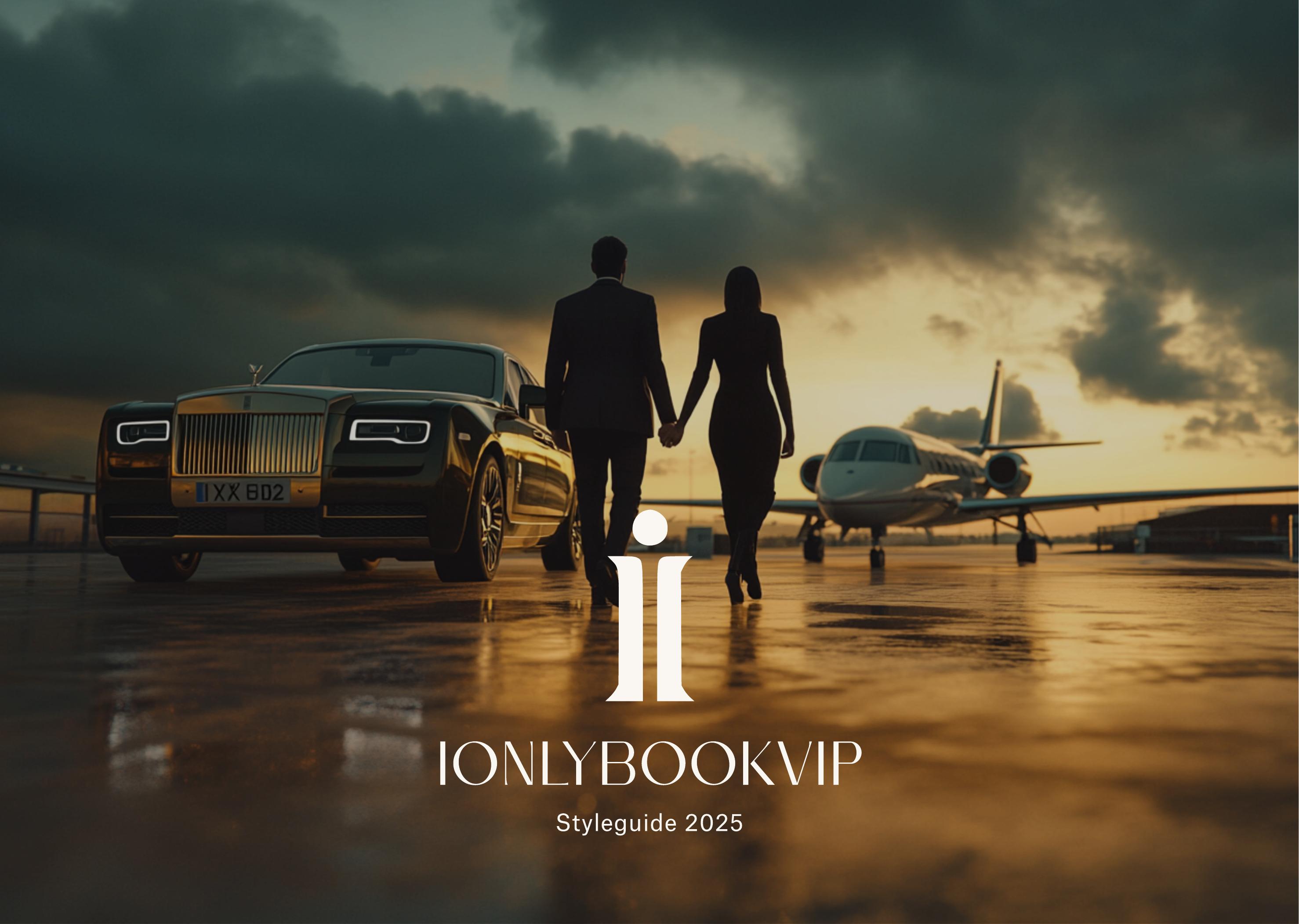
Cover
The guideline's cover: a Rolls-Royce and private jet at dusk, with the ii brandmark, Styleguide 2025.
Colour Palette
The documented palette, Registration Black through Ultra Pure White, shown against a dark green textured background.
Typography
The fonts page: Golden for display, Atlas Grotesk for body, set on a deep green background.
Brought to Life
A brand voice that had to hold up in every message, not just the homepage.
This positioning was built into a Webflow landing page with neurodesign and animation applied to the WhatsApp CTA, plus a custom-trained GPT to keep ongoing content and client communication in the brand's voice, and SEO, analytics, and pixel tracking underneath it all.
The Thinking
Premium concierge services in this category tend to land on one of two extremes: opaque and inaccessible, or generic and impersonal.
Brief
Who They're Really Serving
IOnlyBookVIP's audience is young, high earning, and highly online: agency owners, crypto traders, and content creators whose day-to-day flying experience doesn't match what they've actually built. Every decision had to answer one question: does this feel discreet, secure, and effortless.
Strategy
A Person, Not a Platform
The brand was positioned deliberately against both extremes, quietly exclusive rather than showy, and built around a real person rather than an anonymous service. That meant putting founder Kelvin front and centre as concierge, curator, and connector, with a WhatsApp-first CTA as the site's single main action.
Creative Direction
Quiet Dominance
Registration Black and the near-black Pinch of Pepper set a private, elite foundation, grounded by Chestnut Green. Treasured, a sophisticated bronze gold, and the softer Farina add understated wealth, paired with an expressive display face for headlines and a clean sans-serif for body copy.
"Consider it handled."
Brand Slogan, IOnlyBookVIP Styleguide
The Takeaway
For an audience that already has money, the differentiator was never going to be price.
It was discretion, a real person, and a brand that signalled quiet dominance before a single message was sent. That's a positioning call, not a design trend.