Van Straaten Trading's brandbook carries the identity onto apparel and everyday carry, straight from the guideline's own mock-up pages.
Headwear
Apparel
In Use
Apparel
The wordmark, placed quiet and centred on the back.
Tech
The Palette
Colour, straight from the brandbook.
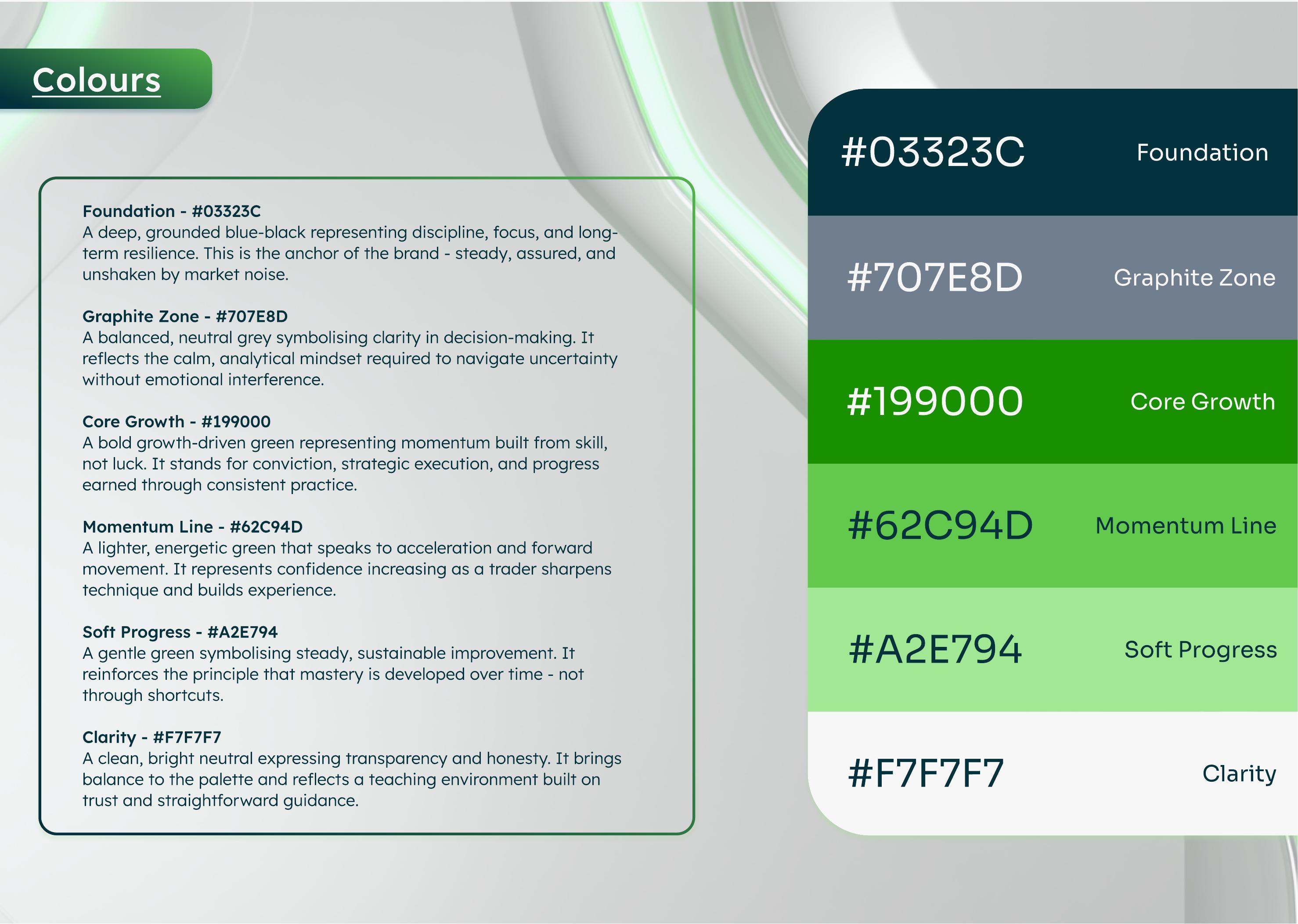
Documented in the guidelines as six named tones moving from Foundation through to Clarity, anchored by a deep blue-black and built up through a growth-driven green gradient.
#03323C
Foundation
A deep, grounded blue-black representing discipline, focus, and long-term resilience. The anchor of the brand, steady and unshaken by market noise.
#707E8D
Graphite Zone
A balanced, neutral grey symbolising clarity in decision-making, reflecting the calm, analytical mindset required to navigate uncertainty.
#199000
Core Growth
A bold growth-driven green representing momentum built from skill, not luck. Stands for conviction and progress earned through practice.
#62C94D
Momentum Line
A lighter, energetic green speaking to acceleration and forward movement, representing confidence increasing as a trader sharpens technique.
#A2E794
Soft Progress
A gentle green symbolising steady, sustainable improvement. Mastery is developed over time, not through shortcuts.
#F7F7F7
Clarity
A clean, bright neutral expressing transparency and honesty, bringing balance to a teaching environment built on trust.
Typography
The typefaces documented in the brandbook.
Typeface
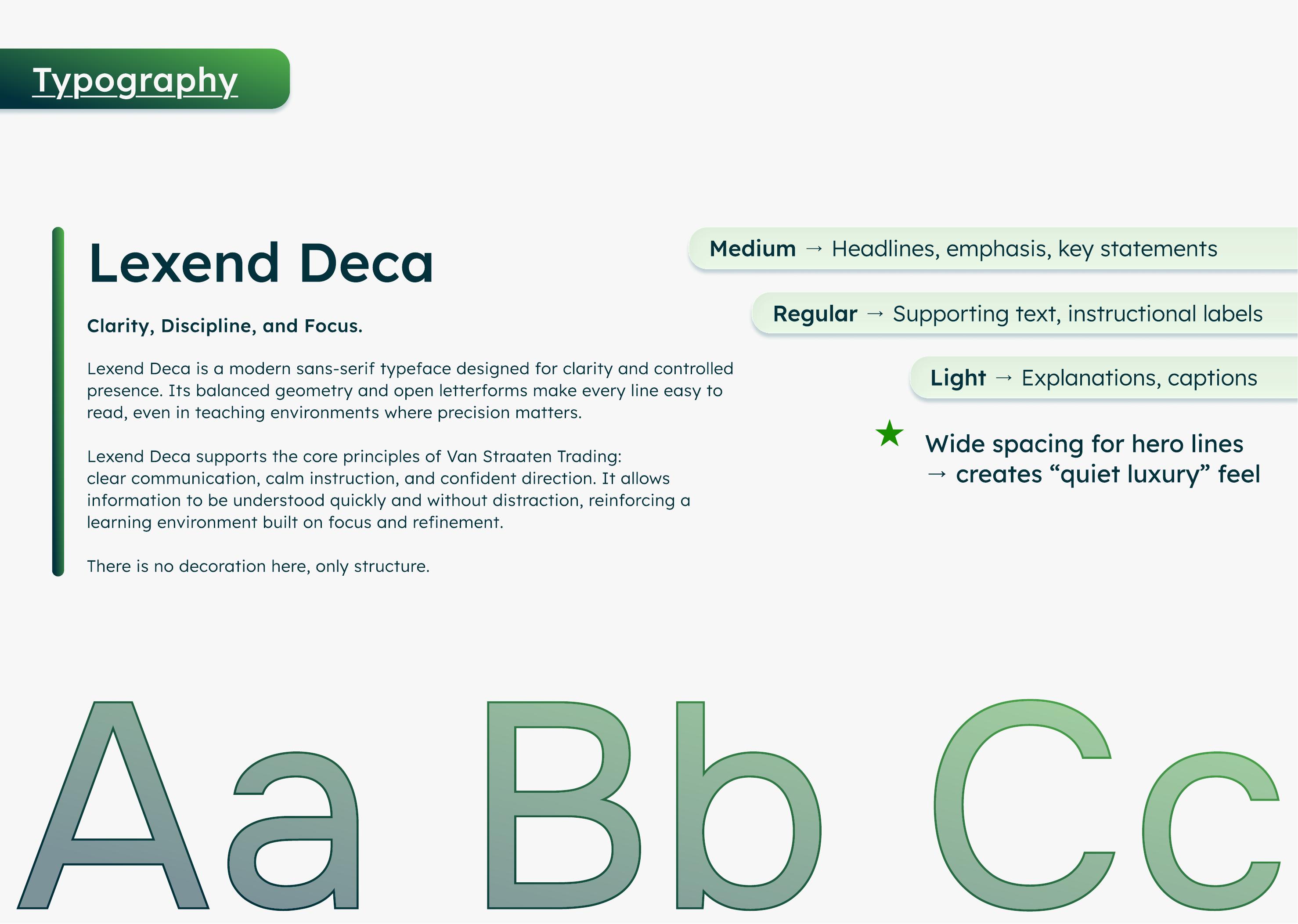
Lexend Deca
A modern sans-serif designed for clarity and controlled presence. Its balanced geometry and open letterforms make every line easy to read, even in teaching environments where precision matters.
Voice
Wide tracking
Wide letter spacing on hero lines is used deliberately, the same quiet luxury feel documented for hero moments.
On this page, Fraunces stands in for display moments and Space Grotesk for the Lexend Deca body system, matching the calm, disciplined tone documented in the guidelines.
The Brandbook
Straight from the guidelines document.
Three spreads pulled directly from Van Straaten Trading's brand guidelines, the source for every colour and font named on this page.
Cover
The guideline's cover: brushed steel and glass with a streak of Core Growth green, Brand Guidelines, Weblyfe, November 2025.
Colour Palette
The documented six-tone palette, Foundation through Clarity, shown as full-bleed swatches with usage notes.
Typography
The typography page: Lexend Deca shown across Medium, Regular, and Light weights, with usage roles.
Brought to Life
A promise of value first that could scale without manual follow-up.
This positioning carried through into a Webflow site, a content strategy connected directly to a video editing team, and ManyChat automations delivering free and paid content.
The Thinking
A brand built to stand out precisely by refusing to perform.
Brief
Building the Anti-Guru
Van Straaten Trading's target trader had typically already lost money and time to mentors and courses that oversold a lifestyle and hid the substance behind a paywall. Per the guidelines, the brand exists to teach skill that lasts, no hype, no signals, no shortcuts. Geen onzin. Alleen resultaat.
Strategy
Value First, By Design
The customer journey was mapped before any visual work started: how a skeptical, previously-burned trader moves from stranger to free-content consumer to trusting community member to paying student. Free community, paid courses, and mentorship were mapped as one coherent path rather than four competing offers.
Creative Direction
Steady, Not Loud
Foundation, a deep blue-black, anchors the brand as disciplined and unshaken by market noise, paired with the neutral Graphite Zone and a growth-green trio representing skill-based progress. Typography is Lexend Deca, chosen because it has no decoration, only structure.
"The market rewards patience, discipline, and understanding, and so do we."
Company Description, Van Straaten Trading Brand Guidelines
The Takeaway
In a market built on noise, the strongest positioning move was to build something quieter.
The palette, the copy, the offer structure, all restraint, on purpose. That's what makes the brand distinct in a category that usually shouts, and it only works because the strategy came before the screens.