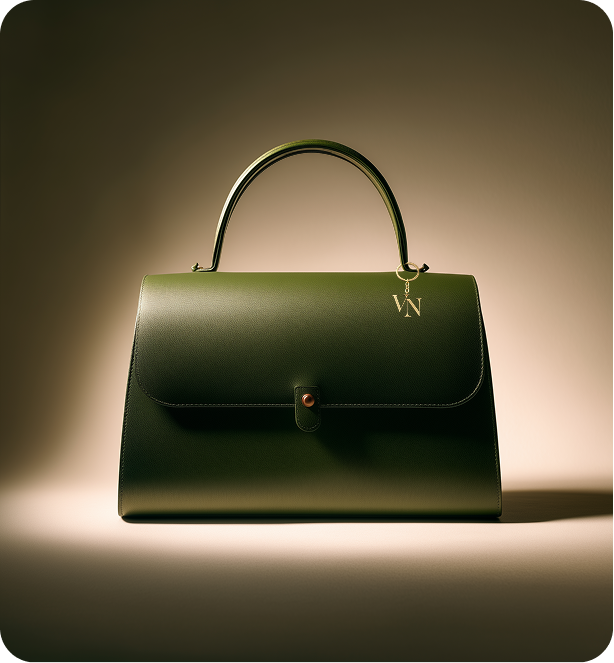
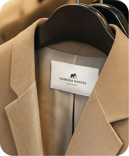
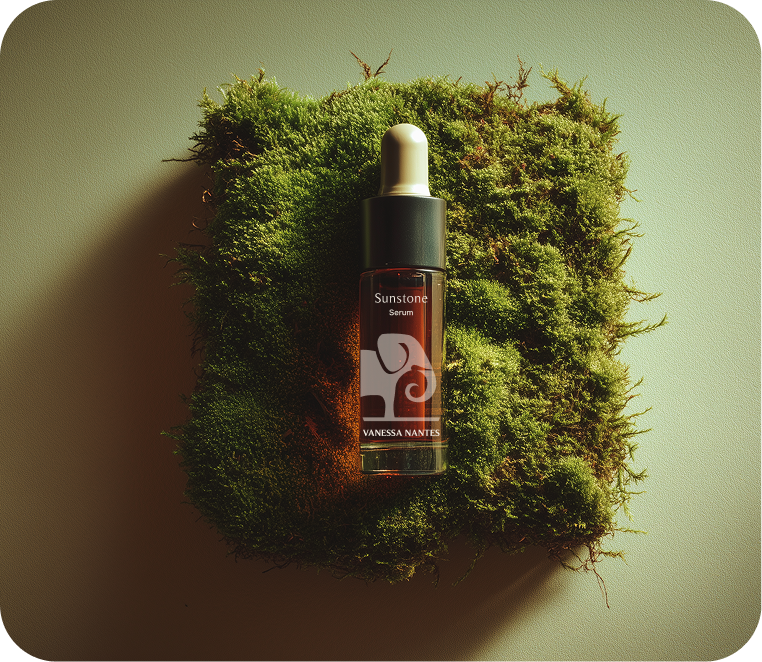
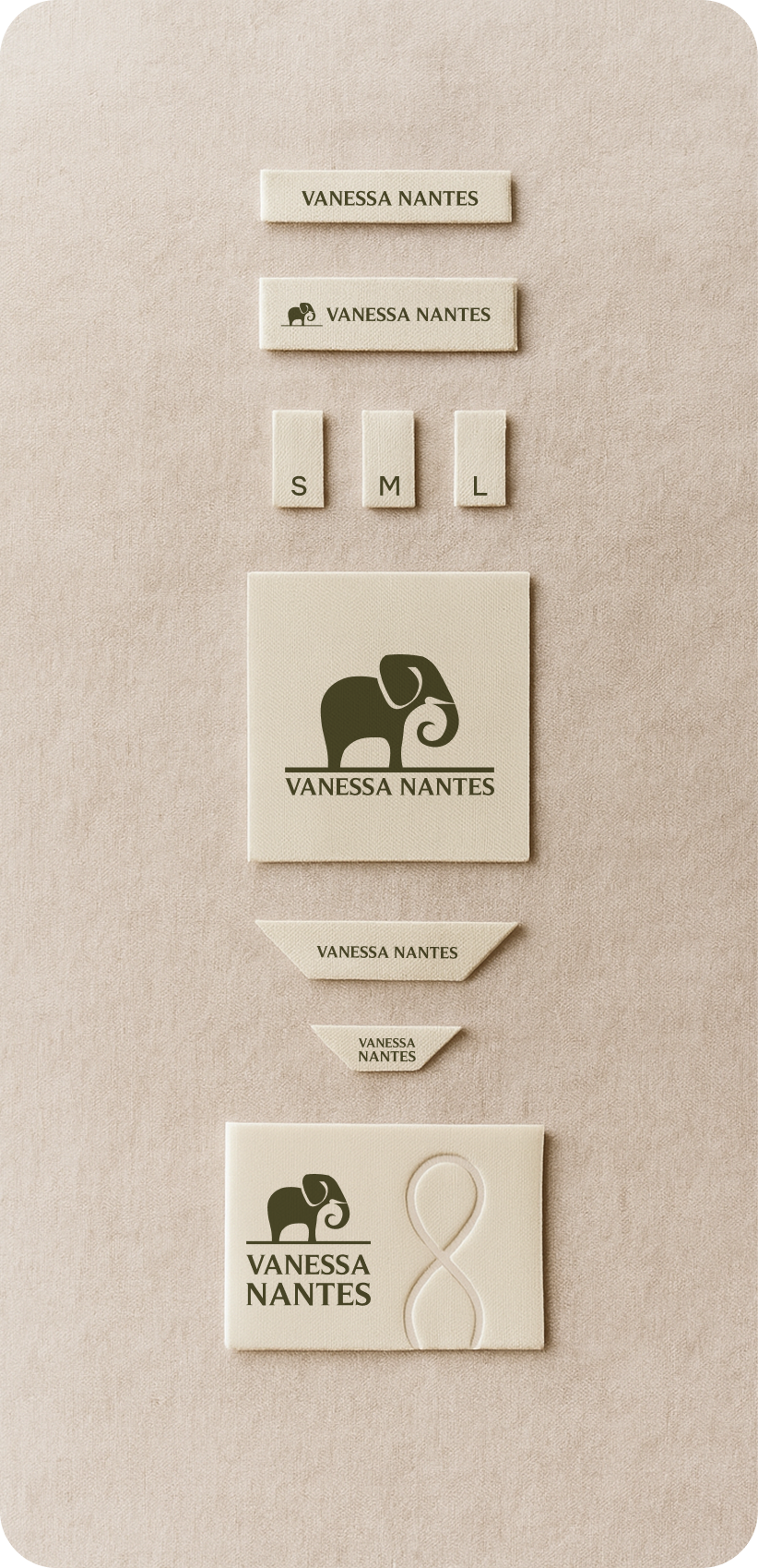
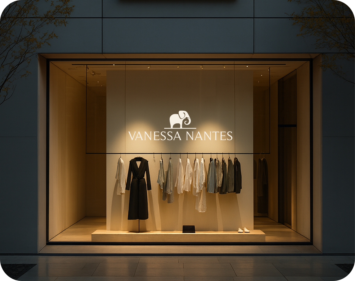
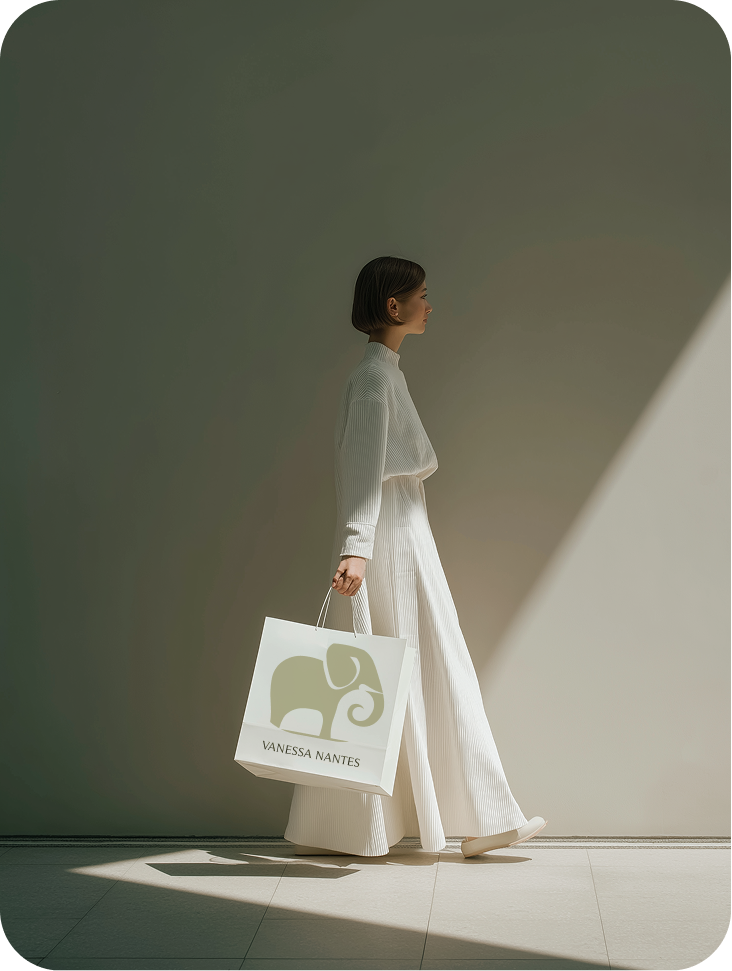
From garment labels and woven tags to the boutique window, the identity carries the same restraint from the styleguide onto every touchpoint a customer or retailer actually sees.
Accessories
Garment Label
Skincare
Tags & Labels
Storefront
Lifestyle
The Campaign
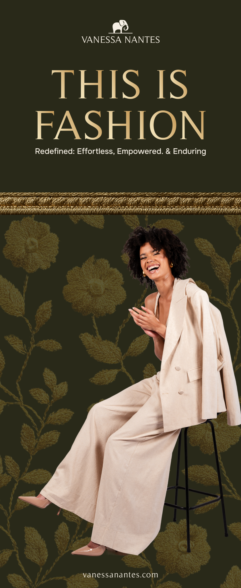
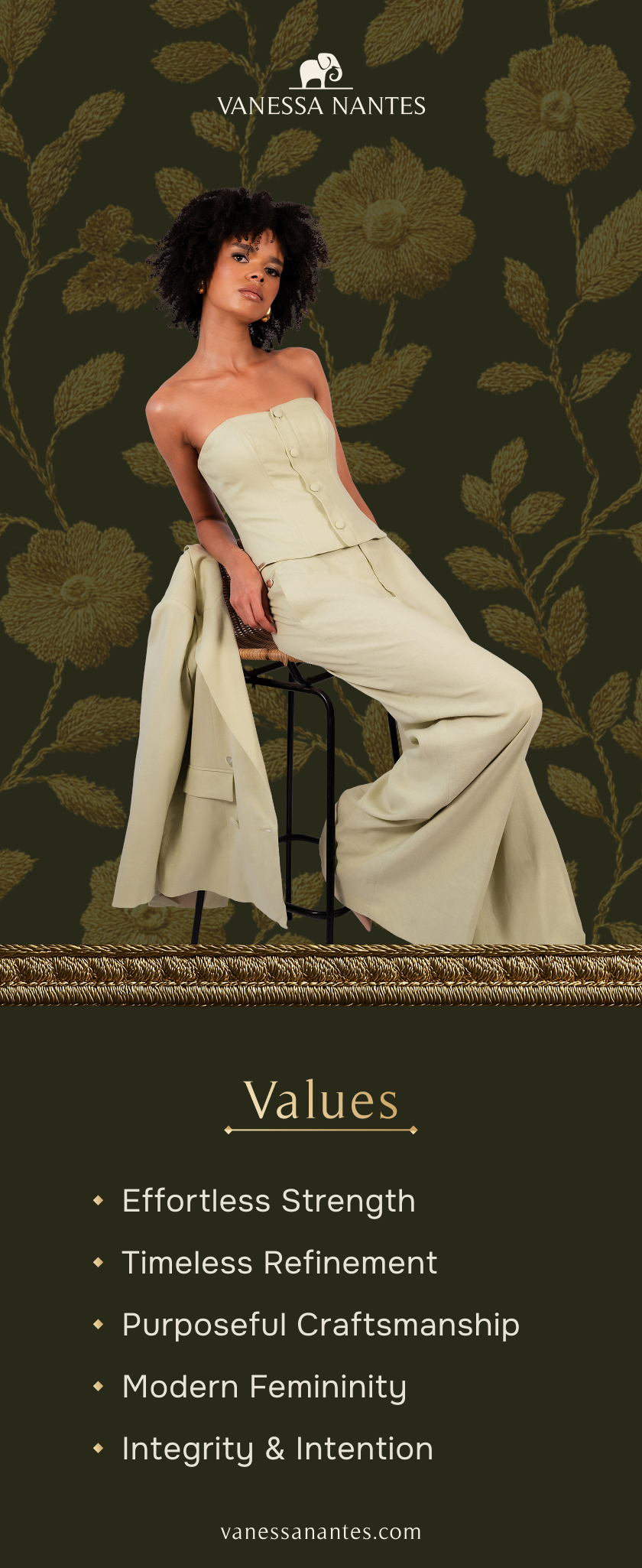
The identity, brought onto the shop floor.
Two pull-up banners built for the boutique, carrying the brand description word for word: effortless, empowered, and enduring. One leads with the tagline, the other with the five values that anchor the brand.
Brand Statement
Three words carrying the whole brand: effortless, empowered, enduring.
The Pillars
What the brand stands for, said plainly instead of implied.
The Palette
Colour, straight from the brandbook.
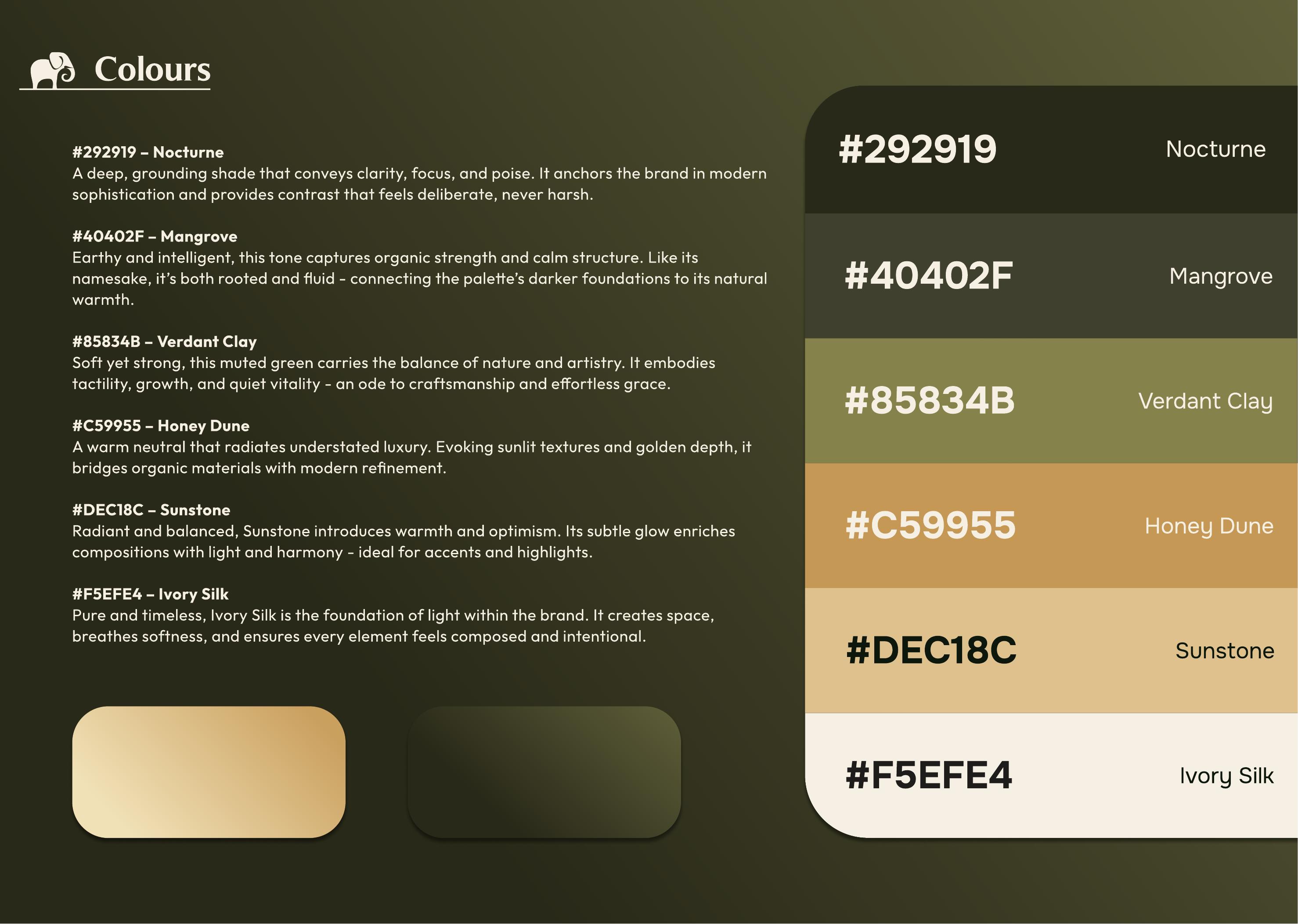
Documented in the Vanessa Nantes styleguide as six named tones moving from Nocturne through to Ivory Silk.
#292919
Nocturne
A deep, grounding shade that conveys clarity, focus, and poise. Anchors the brand in modern sophistication.
#40402F
Mangrove
Earthy and intelligent. Connects the palette's darker foundations to its natural warmth.
#85834B
Verdant Clay
A muted green carrying the balance of nature and artistry, an ode to craftsmanship.
#C59955
Honey Dune
A warm neutral radiating understated luxury, evoking sunlit textures and golden depth.
#DEC18C
Sunstone
Radiant and balanced, introducing warmth and optimism to accents and highlights.
#F5EFE4
Ivory Silk
The foundation of light within the brand. Pure, timeless, and composed.
Typography
The typefaces documented in the brandbook.
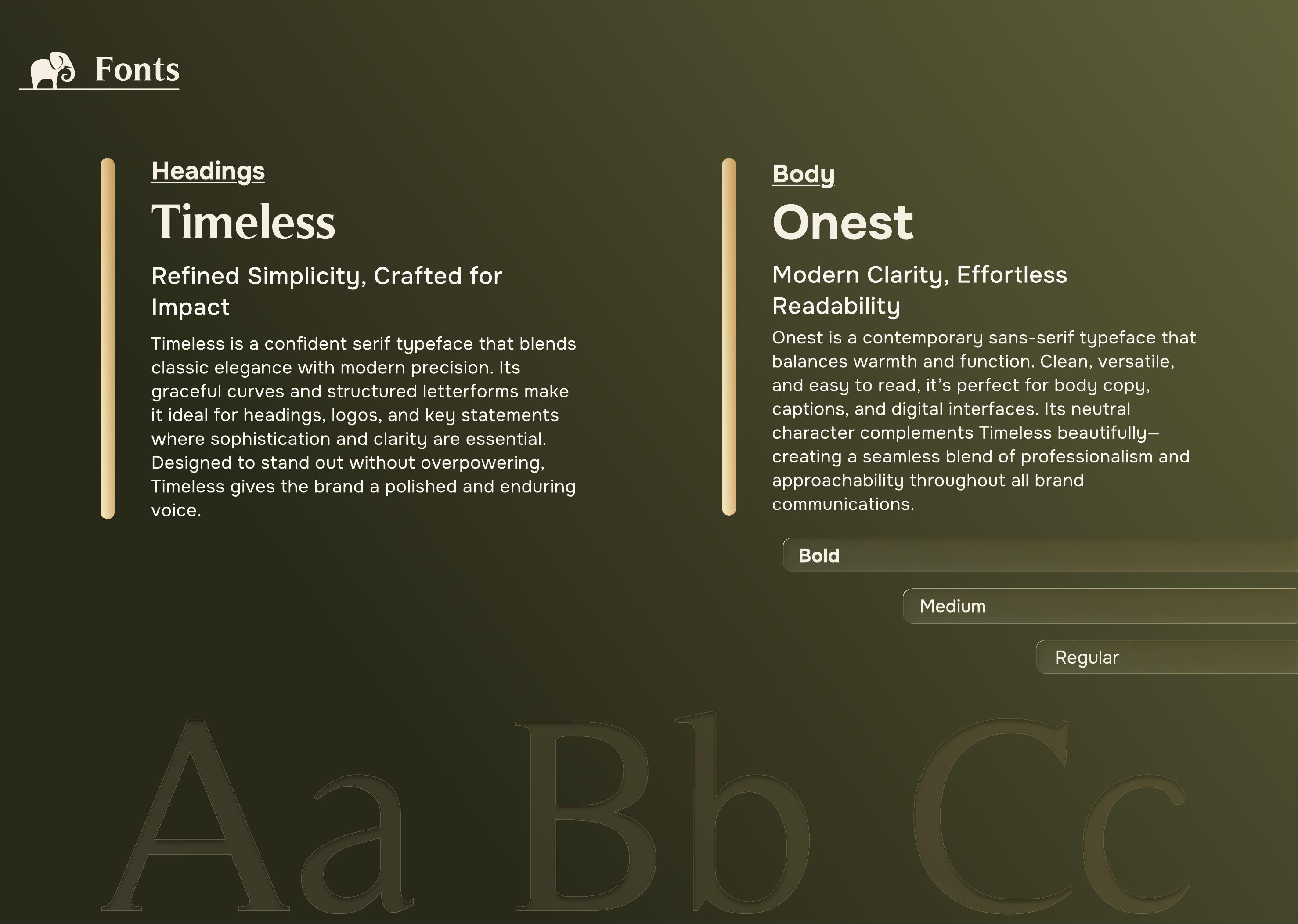
Headings
Timeless
A confident serif blending classic elegance with modern precision, used for headings, logos, and key statements.
Body
Onest
A contemporary sans-serif balancing warmth and function, used for body copy and digital interfaces.
On this page, Fraunces and Space Grotesk stand in for Timeless and Onest to keep the portfolio's own type system consistent.
The Brandbook
Straight from the guidelines document.
Three spreads pulled directly from Vanessa Nantes's brand styleguide, the source for every colour and font named on this page.
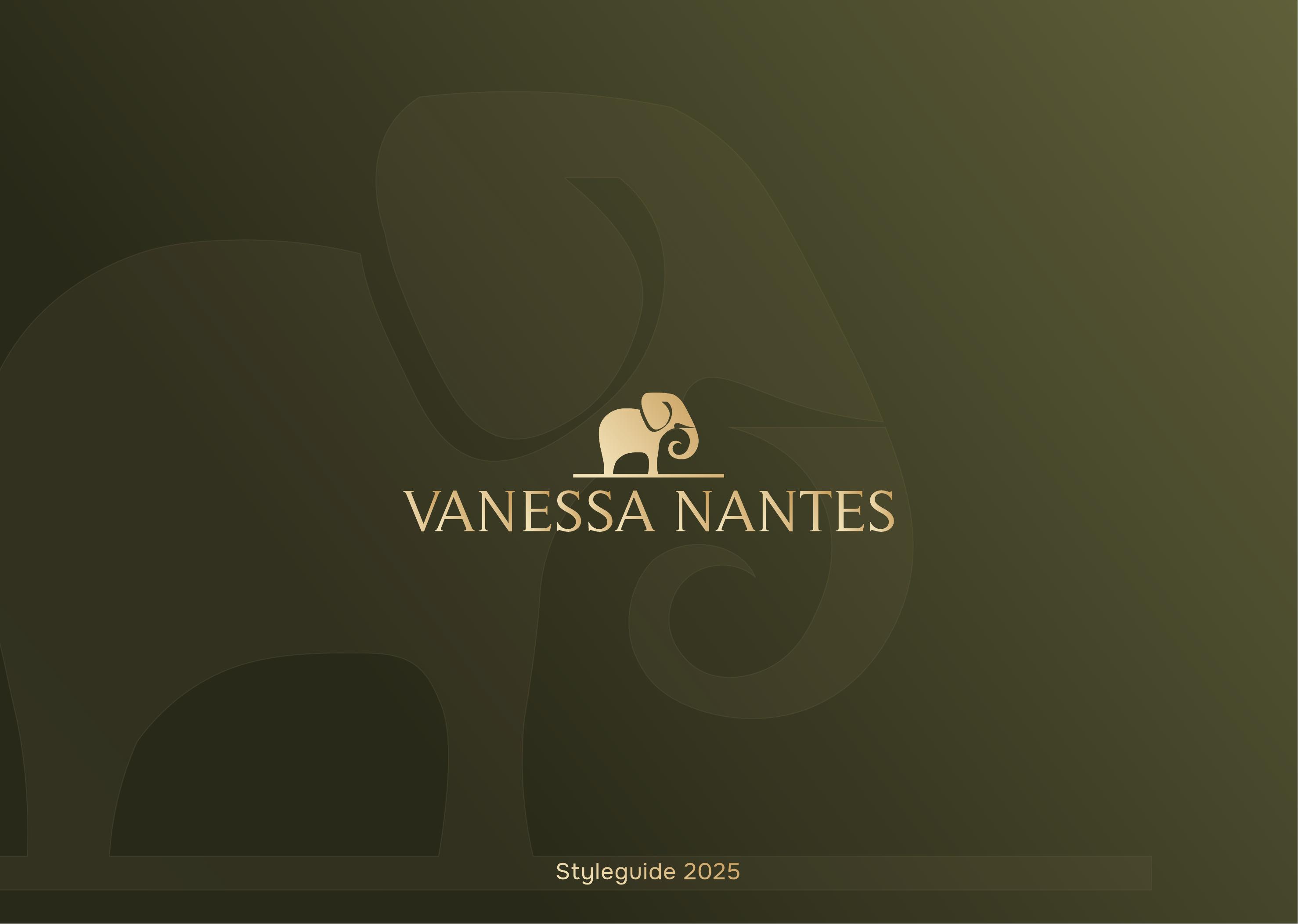
Cover
The guideline's cover: the elephant brandmark on an olive gradient, titled Vanessa Nantes, Styleguide 2025.
Colour Palette
The six-tone palette exactly as documented, Nocturne through Ivory Silk, with usage notes for each shade.
Typography
The fonts page: Timeless for headings, Onest for body copy, shown at full type scale.
The Thinking
One brand had to work equally well in a boutique fitting room and a wholesale sales pitch, without ever feeling like two different brands.
Brief
One Brand, Two Buyers
Vanessa Nantes sits in a narrow lane: affordable luxury womenswear, positioned just above mainstream premium brands and just below high-end names. It needed to sell directly to a time-poor professional woman and, in parallel, close long-term partnerships with fashion agents and premium retailers across the Benelux and EU.
Strategy
One Consistent Truth
Affordable luxury was defined precisely enough to hold its ground between two tiers of competitor, built around the capsule wardrobe philosophy, efficiency and timelessness as empowerment. For wholesale, the same idea became a commercial argument: a brand that completes a retailer's portfolio rather than competing inside it.
Creative Direction
Restraint, Considered
Nocturne and Mangrove anchor the brand in poise and clarity, Verdant Clay adds tactile vitality, and Honey Dune and Sunstone bring warmth against a soft Ivory Silk. Timeless carries the logo and headlines, Onest carries the body copy, a pairing built to read as premium on a shelf and credible in a wholesale deck.
"This is fashion, redefined. Effortless, empowered, and enduring."
Brand Description, Vanessa Nantes Styleguide
The Takeaway
Vanessa Nantes needed a brand that could hold two conversations at once, with the woman wearing it, and with the retailer selling it, without diluting either.
That only works when the strategy comes first: define the gap precisely, then let the creative direction carry the same restraint into every room the brand walks into.