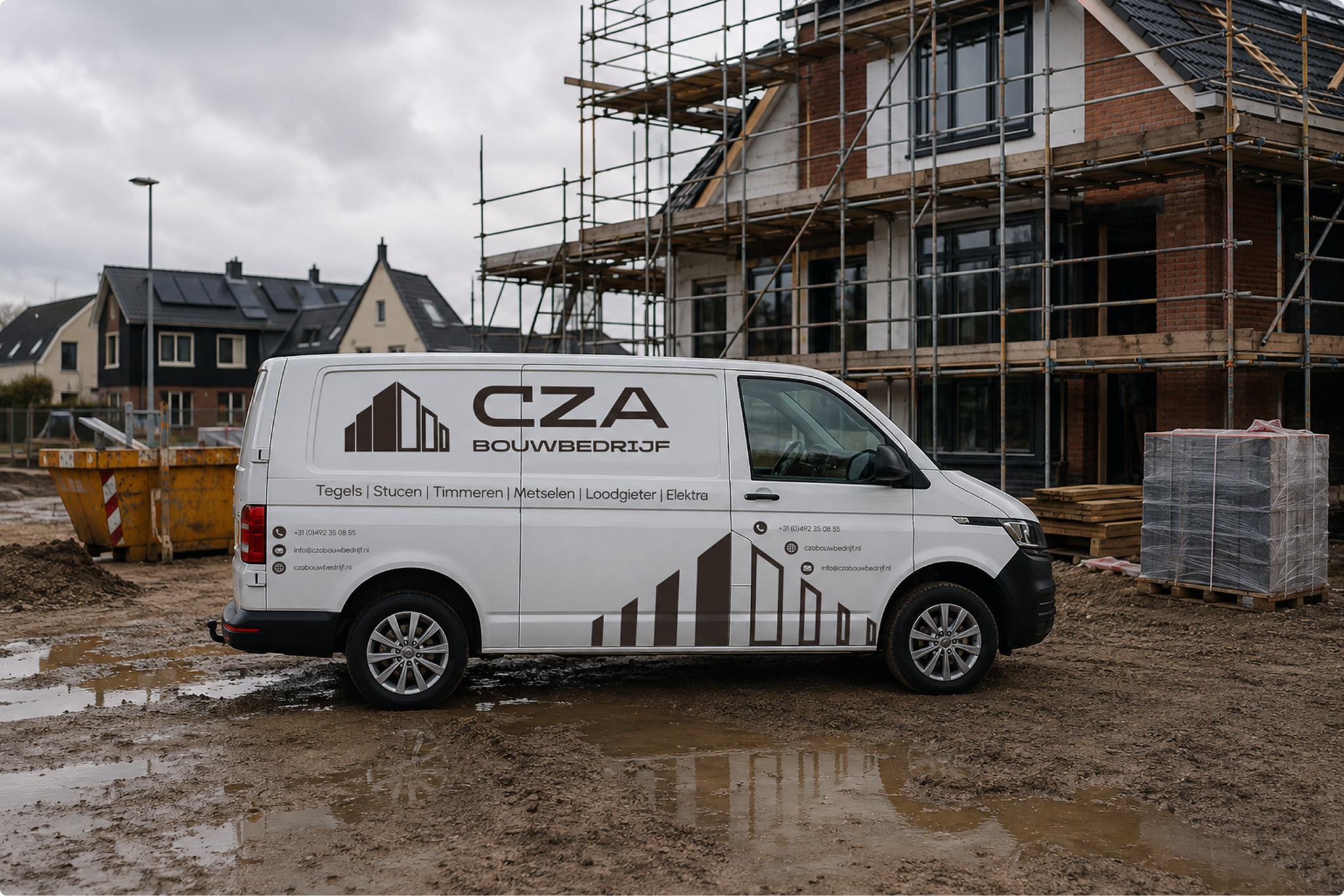
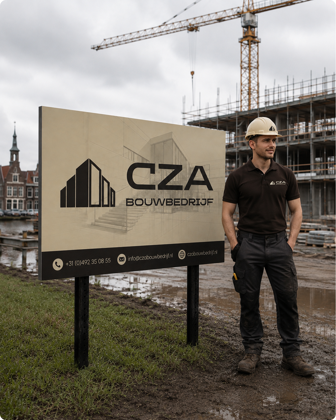
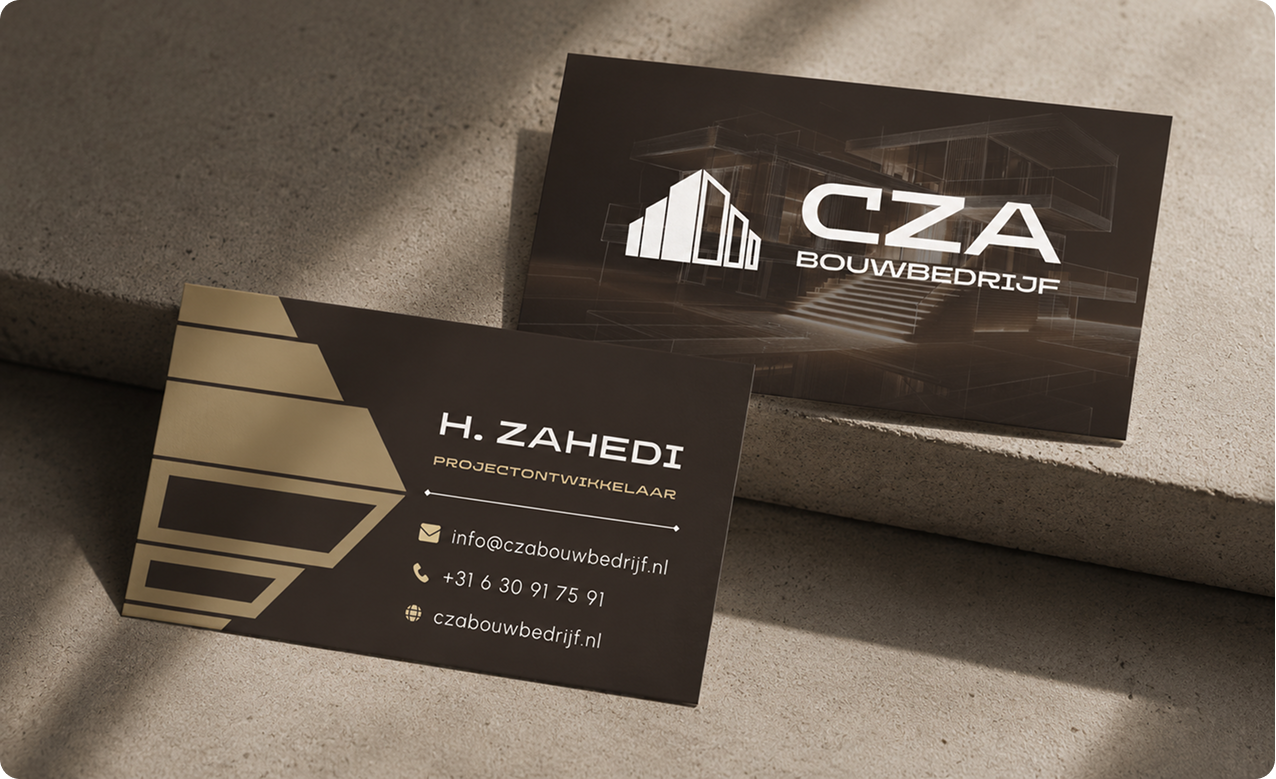
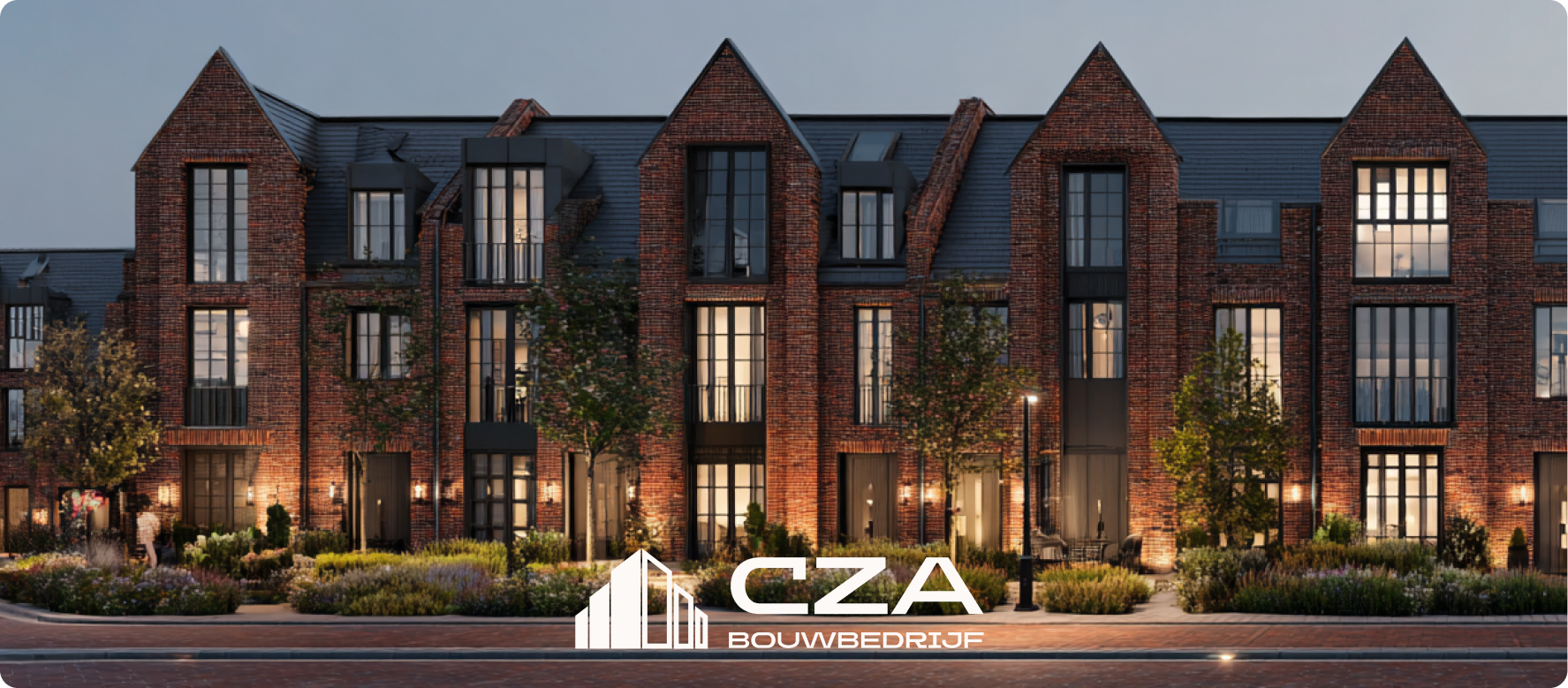
The CZA mark applied across the physical touchpoints that carry the brand on site, on the road, and in the client's hand.
Vehicle Signage
Site Signage
Business Cards
Project Render
The Palette
Colour, straight from the brandbook.
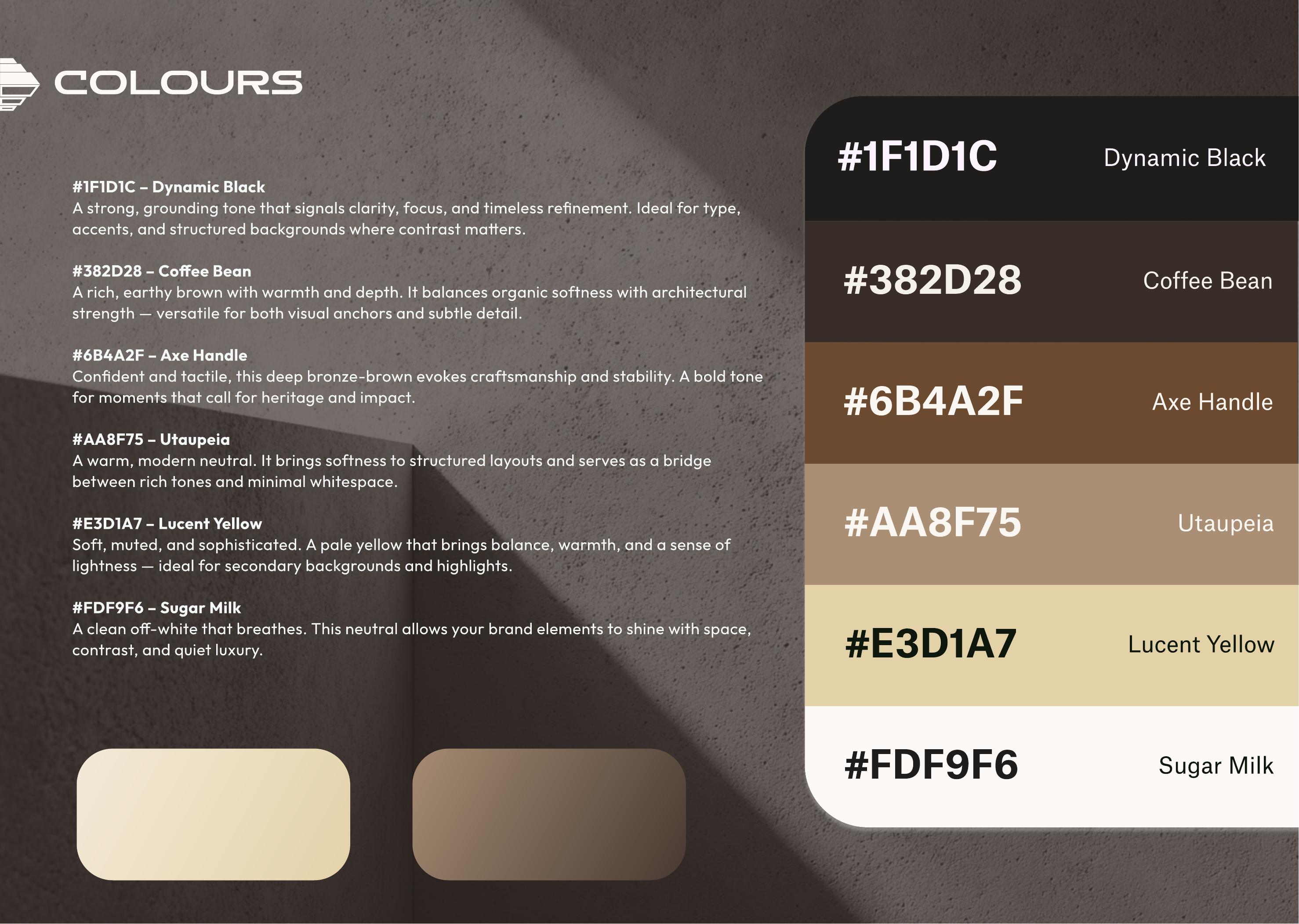
Six named tones documented in the CZA 2025 styleguide, from Dynamic Black through to Sugar Milk.
#1F1D1C
Dynamic Black
A strong, grounding tone signalling clarity, focus, and timeless refinement.
#382D28
Coffee Bean
A rich, earthy brown balancing organic softness with architectural strength.
#6B4A2F
Axe Handle
Confident and tactile, a deep bronze brown evoking craftsmanship and stability.
#AA8F75
Utaupeia
A warm, modern neutral bridging rich tones and minimal whitespace.
#E3D1A7
Lucent Yellow
Soft, muted, and sophisticated, for secondary backgrounds and highlights.
#FDF9F6
Sugar Milk
A clean off white that lets brand elements breathe with quiet luxury.
Typography
The typefaces documented in the brandbook.
Headings
Omega
A confident display typeface with clean lines and bold geometry, used for logos, headlines, and navigation.
Body
Urbanist
A versatile sans-serif bringing structure and softness together, built for long-form readability.
On this page, Fraunces stands in for Omega and Space Grotesk for Urbanist, matching the calm, structured tone documented in the styleguide.
The Brandbook
Straight from the guidelines document.
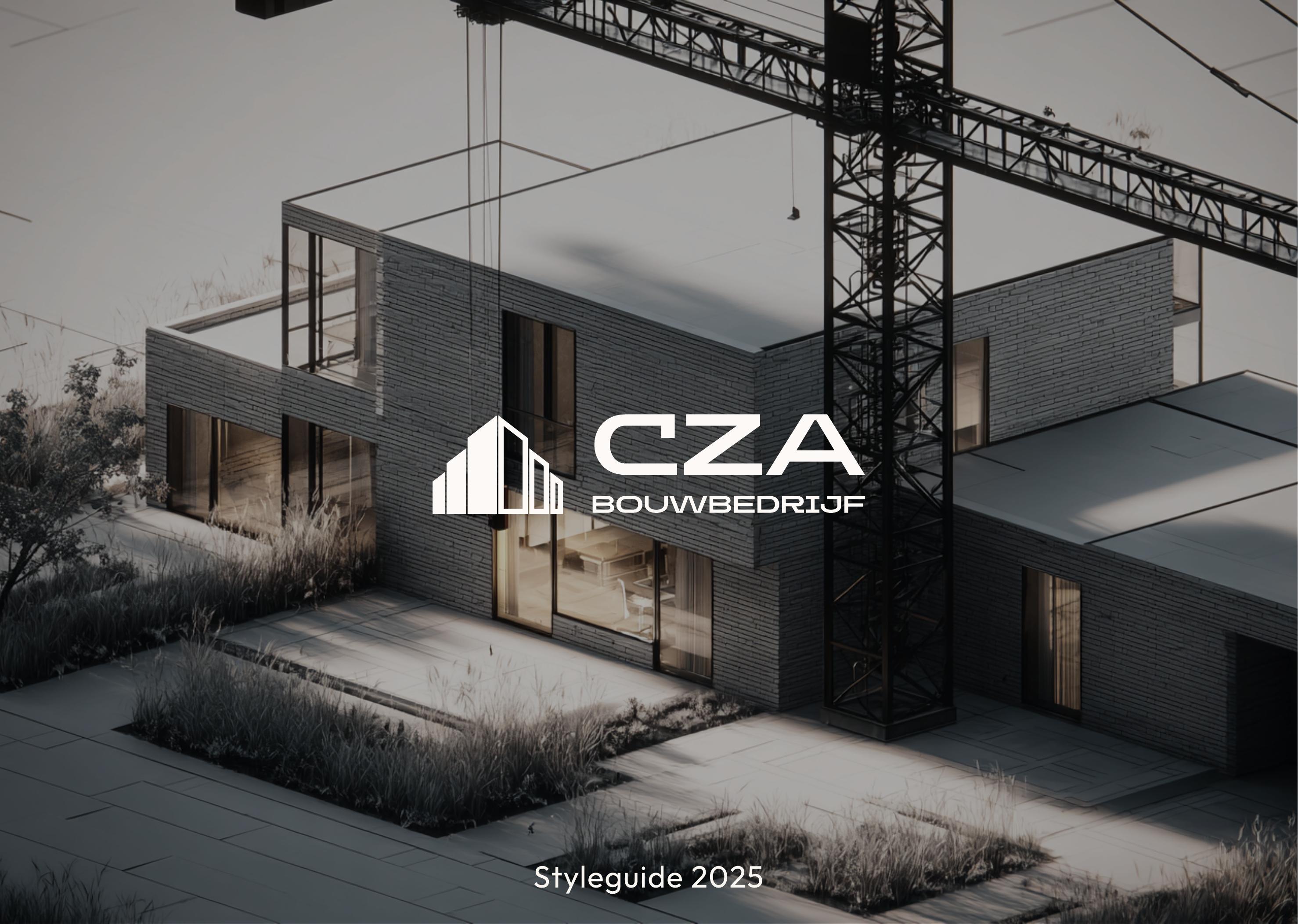
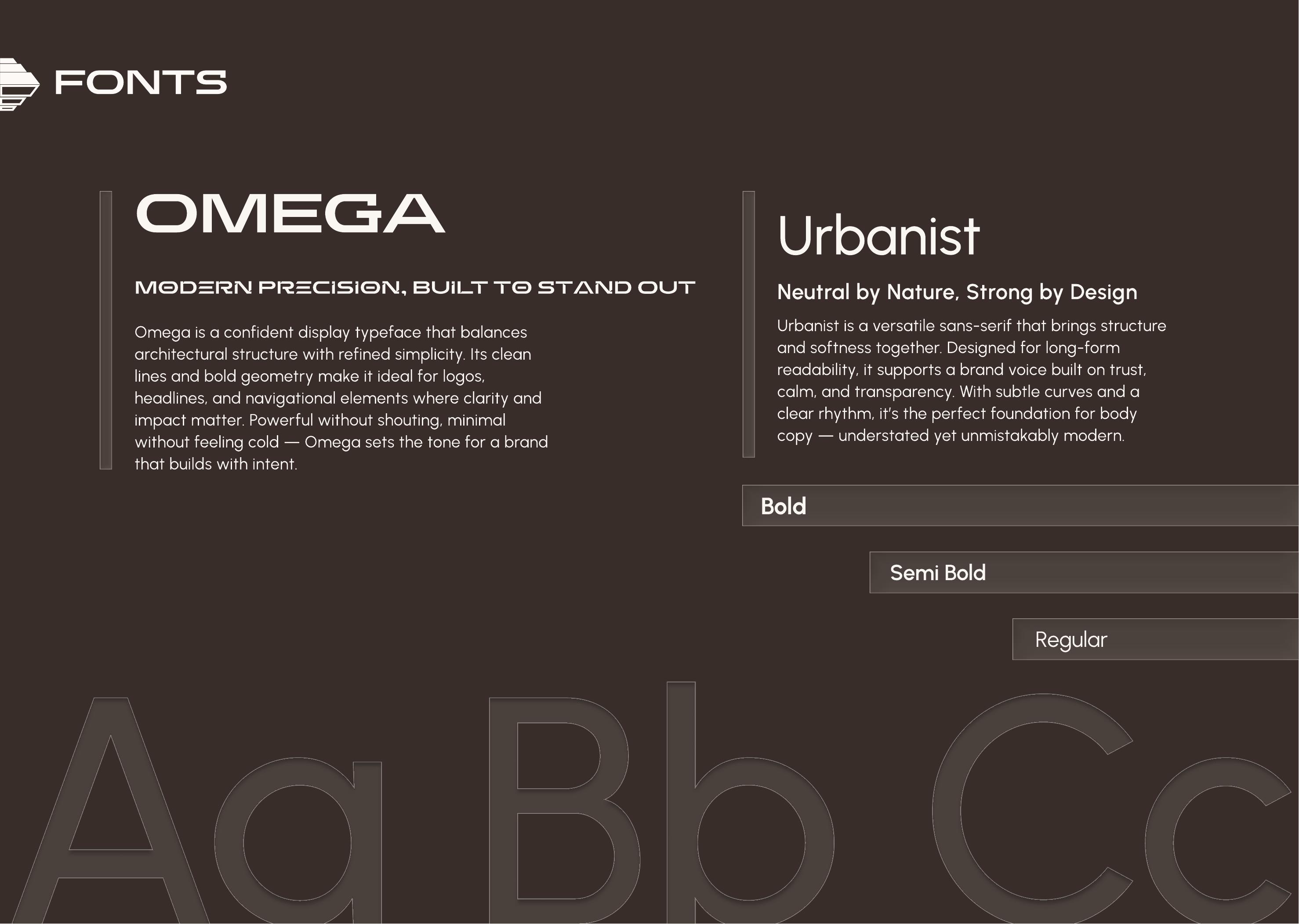
Three spreads pulled directly from CZA Bouwbedrijf's brand styleguide, the source for every colour and font named on this page.
Cover
The guideline's cover: a construction site photo with the CZA Bouwbedrijf logo overlaid, Styleguide 2025.
Colour Palette
The documented palette, Dynamic Black through Sugar Milk, shown against a concrete texture background.
Typography
The fonts page: OMEGA for display, Urbanist for body, set against a dark brown background.
Brought to Life
The operational layer that let the brand experience hold up at scale.
That tone-of-voice and journey work was implemented through a Moneybird and Mollie payment automation, an automatic onboarding booking calendar connecting clients directly to their foreman, and a WhatsApp widget on the site.
The Thinking
Every automated touchpoint treated as a brand moment, not a system notification.
Brief
Protecting a 9.9 out of 10.
CZA Bouwbedrijf had already earned a 9.9 out of 10 Trustoo rating and 50-plus five-star Google reviews. The risk wasn't the identity, it was the gap between a lead filling out a form and a real person picking up the thread, widening as the business grew.
Strategy
Sound like CZA, not software.
The customer journey was mapped first to find exactly where trust is won or lost. That led to a deliberate call: every automated touchpoint, a confirmation email, a payment link, a booking reminder, needed to sound like CZA.
Creative Direction
Materials-first colour.
Every automated message was written in CZA's own voice, grounded in deep, tactile browns and bronze. Omega carries logos and headlines, Urbanist carries calm, trustworthy body copy, built for a market that usually shouts about speed and price.
"This is building, redefined. Modern, refined, and deeply personal."
Company Description, CZA Bouwbedrijf Styleguide
The Takeaway
CZA didn't need a new brand. It needed every touchpoint to sound like the trustworthy business it already was.
Even as automation took over the busywork, that's a brand strategy question as much as a technical one, and it's why the tone-of-voice work mattered as much as the integration itself.